Case study · Visual identity
International Jazz Festival “Varna Summer” — Visual Identity
Evolving a 35-year visual language into a contemporary visual system, preserving the festival’s recognition while creating a more flexible language for new audiences and formats.
- Role
- Lead Graphic Designer
- Project
- 35th International Jazz Festival “Varna Summer”
- Timeline
- 3 months
- Date
- June - August 2026
Status: Completed - visual identity and communication system for the 35th edition.
Impact
Project overview
Evolving a 35-year visual language
Role: Lead Graphic Designer
Project: 35th International Jazz Festival “Varna Summer”
Scope: Art direction · Visual identity · Print and digital communication
For its 35th edition, the festival needed to feel contemporary without losing the recognition built over decades. The project was approached as an evolution of an existing system: identifying what needed to remain, what could change, and how the new language could scale across different formats.
01
Evolving, not replacing
The challenge was to balance heritage, recognition and contemporary relevance.
Rather than creating a new identity from scratch, the festival’s existing visual language became the starting point. The work defined how that language could evolve for a new generation of audiences without making the festival feel unfamiliar.
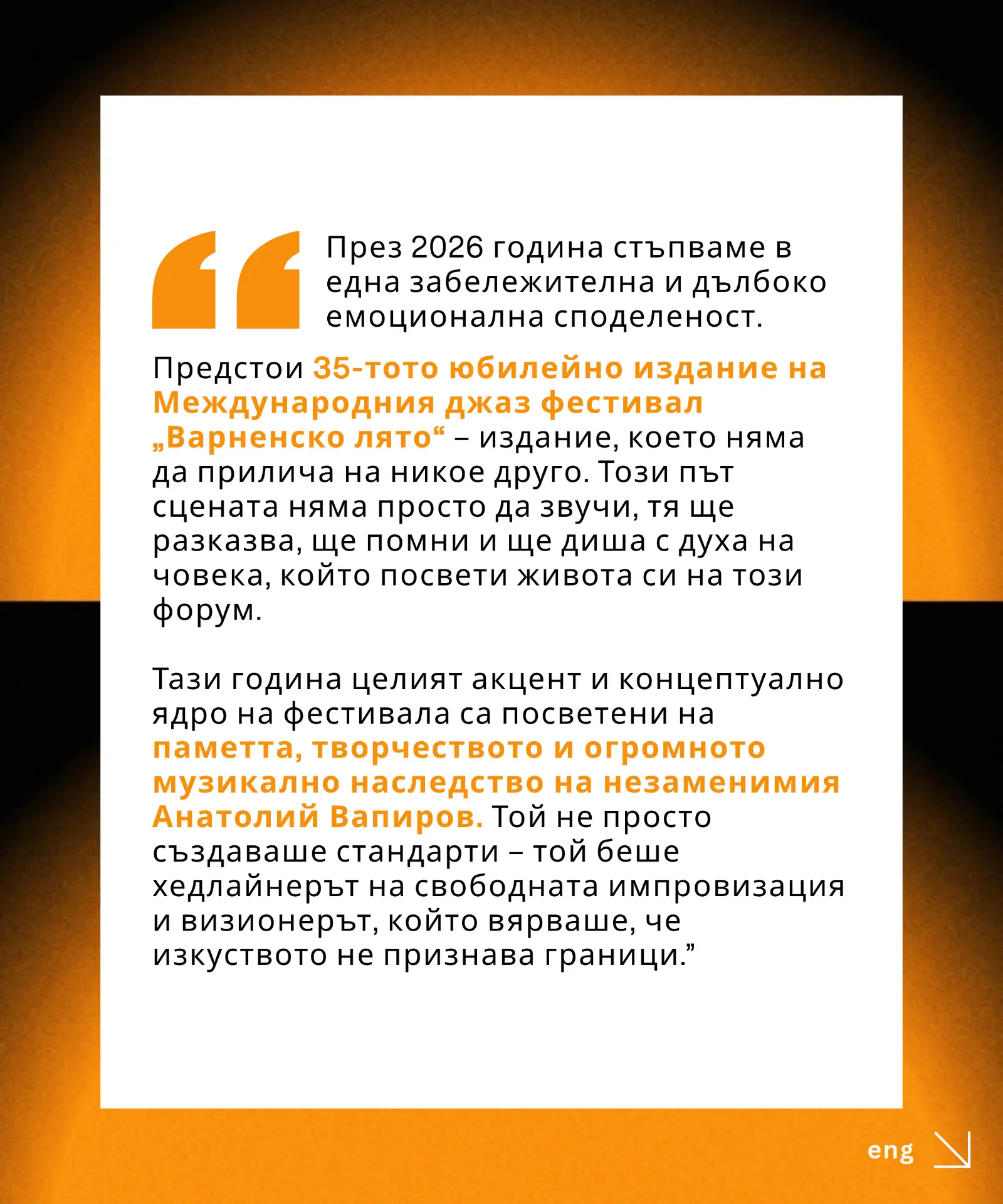
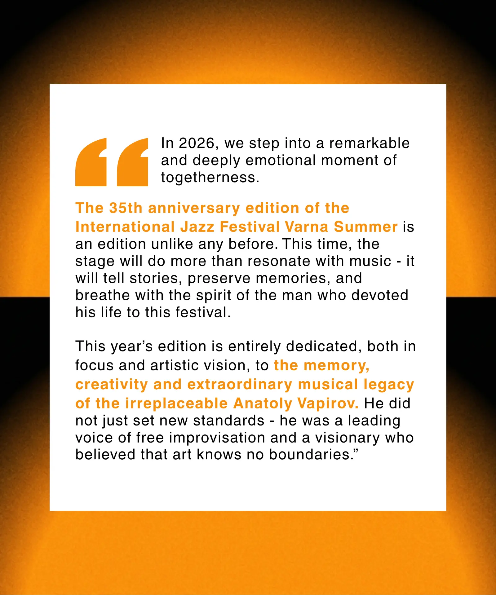
1 / 5
Swipe to explore
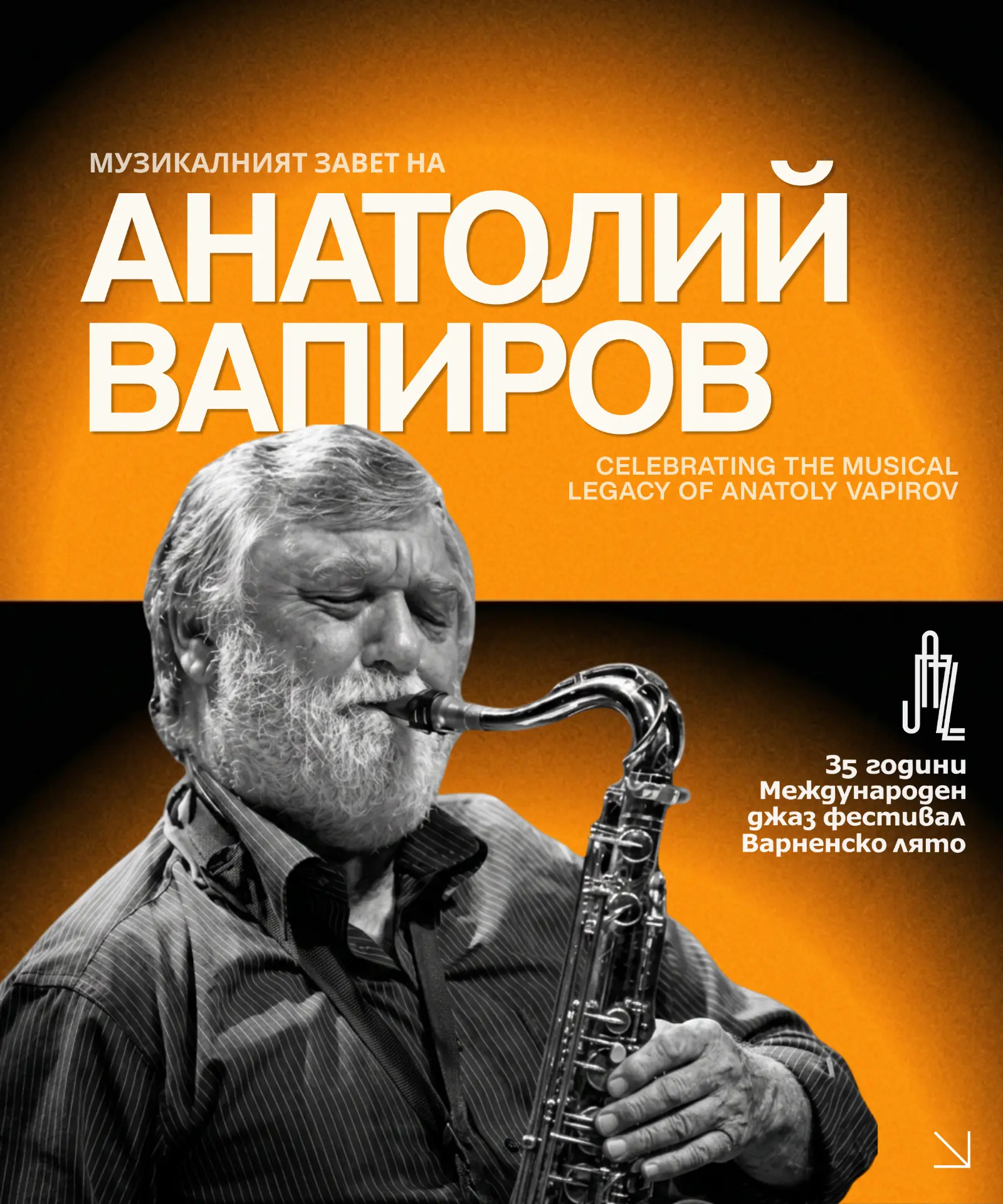
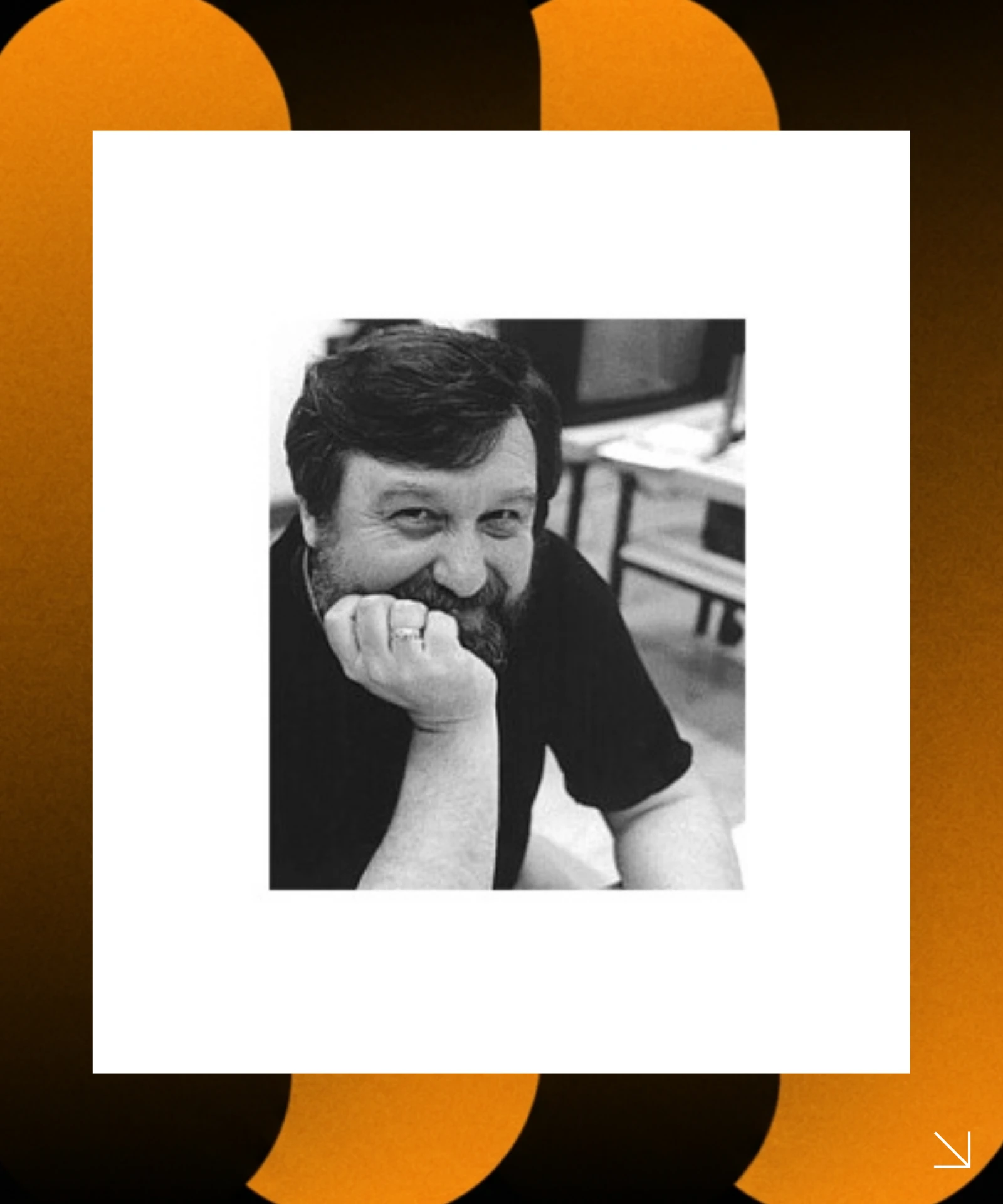
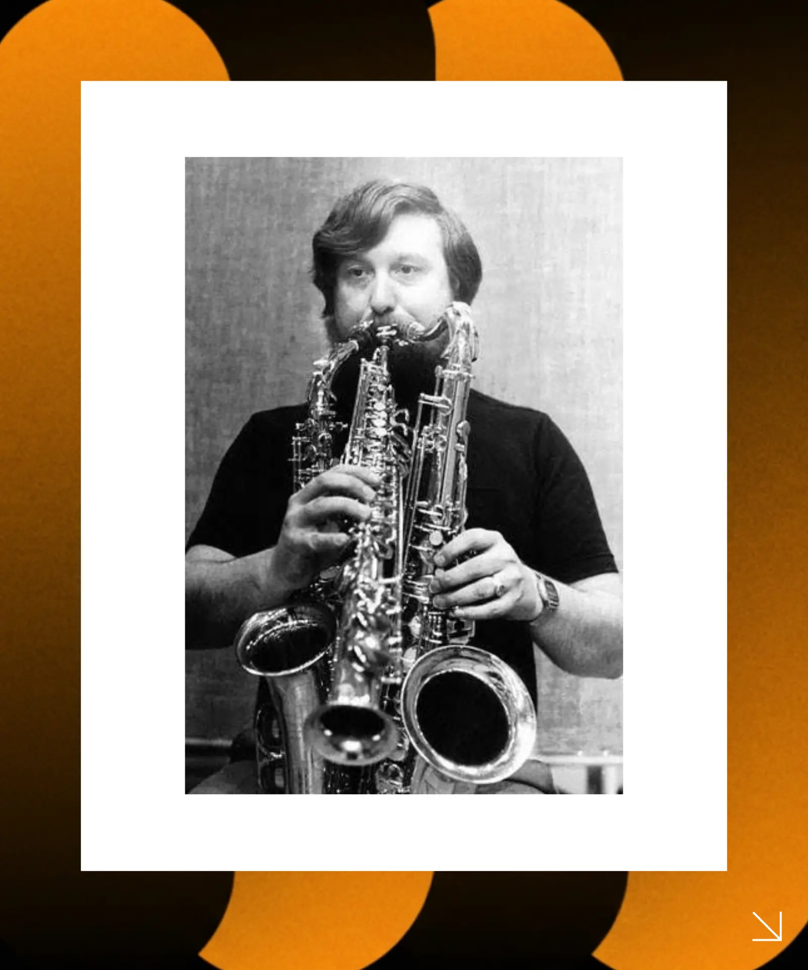
Festival legacy and anniversary narrative
02
Understanding what already works
The festival’s 35-year archive was reviewed to identify recurring patterns across colour, typography, composition, imagery and graphic motifs.
This made it possible to separate the elements that created recognition from the elements that could be reconsidered. Several visual directions were then explored and filtered against the festival’s established character and audience expectations.
The goal was to make the festival feel new without making it feel unfamiliar.
03
From visual direction to system
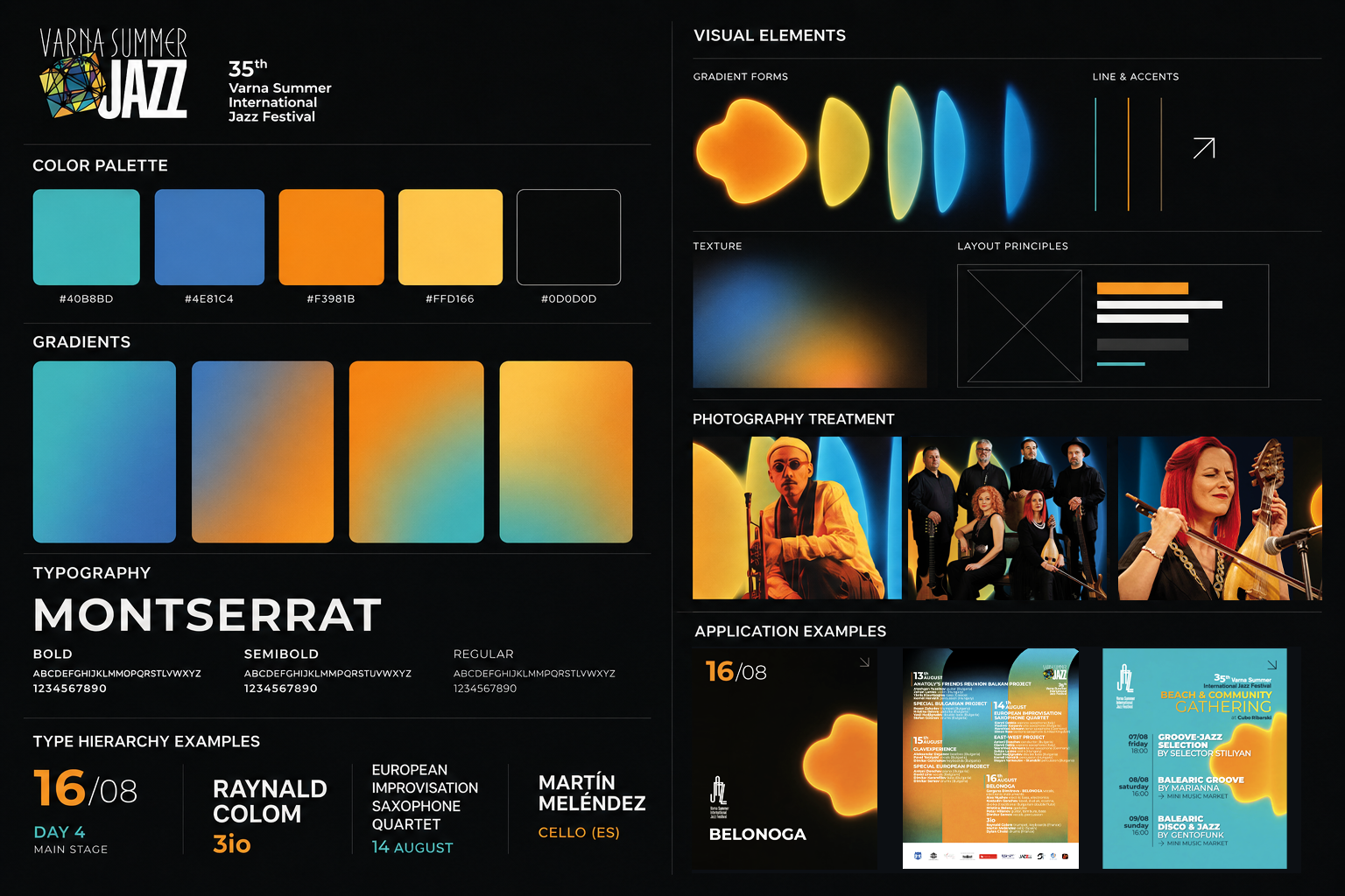
The selected direction was translated into a flexible visual system built around four elements: colour, typography, graphic language and composition.
Colour
Established festival colours provided continuity, while new combinations and gradients created more flexibility.
Typography
A clear hierarchy structured information-heavy festival communication across print and digital formats.
Graphic language
Fluid forms introduced movement and rhythm without relying on literal representations of jazz.
Composition
A flexible relationship between graphic elements and information allowed the system to adapt across formats.
04
One language, multiple touchpoints
The system was applied across the festival’s key communication materials, including posters, programme materials, social media and promotional assets.
The visual elements could be recombined according to the format while maintaining a consistent identity. This balanced visual expression with information clarity.
Print communication
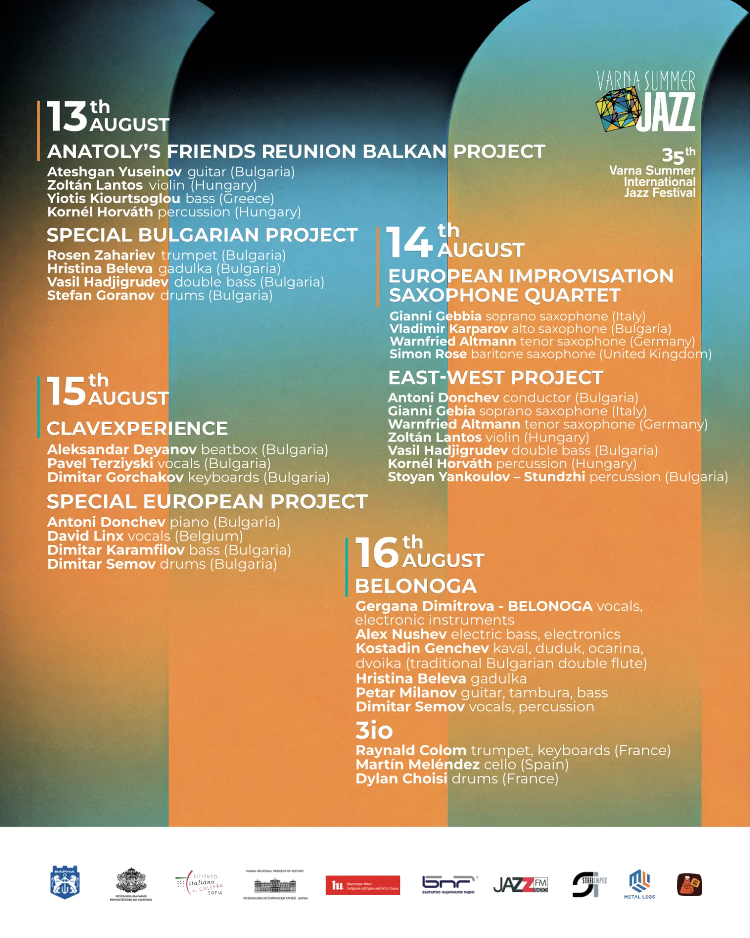
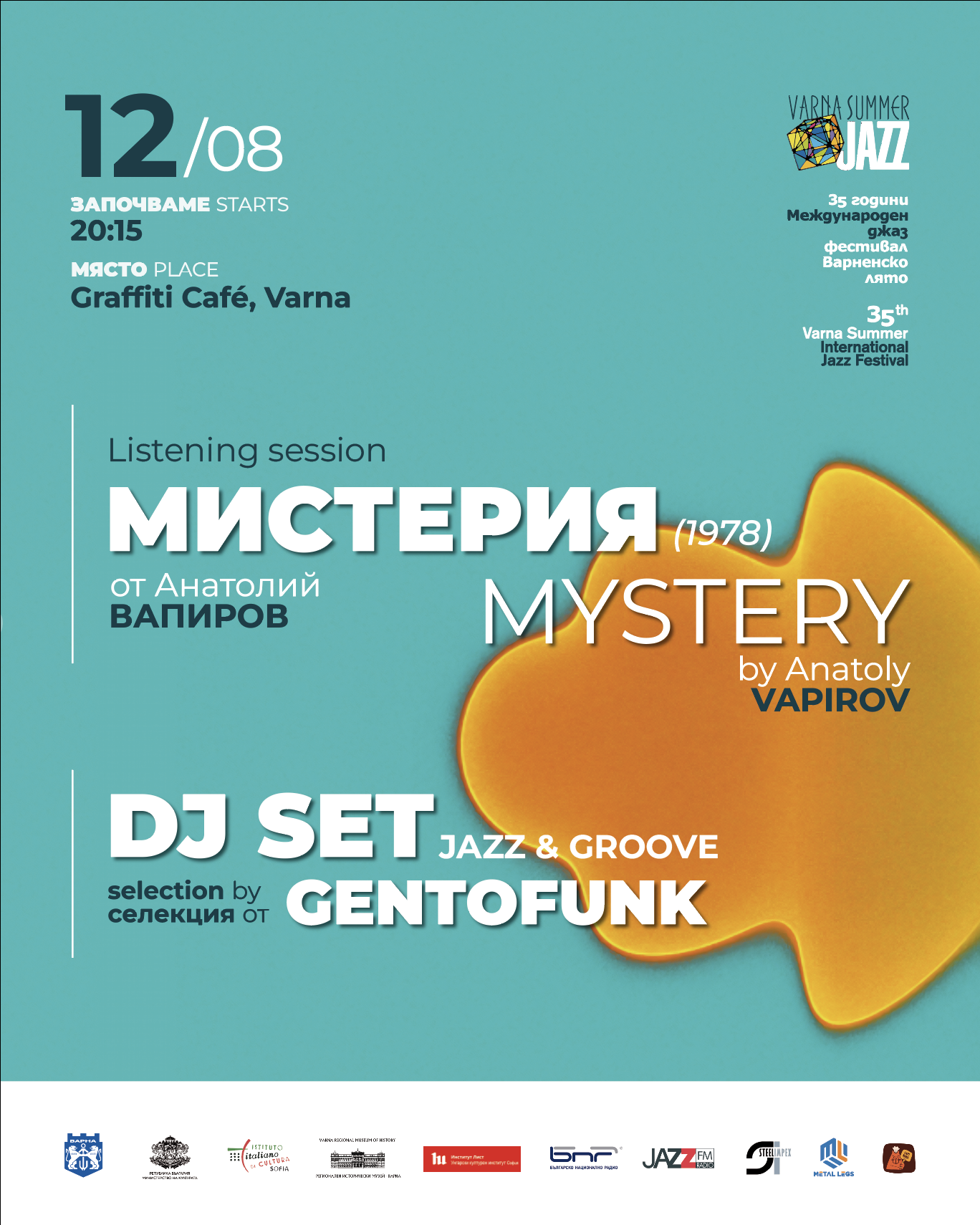
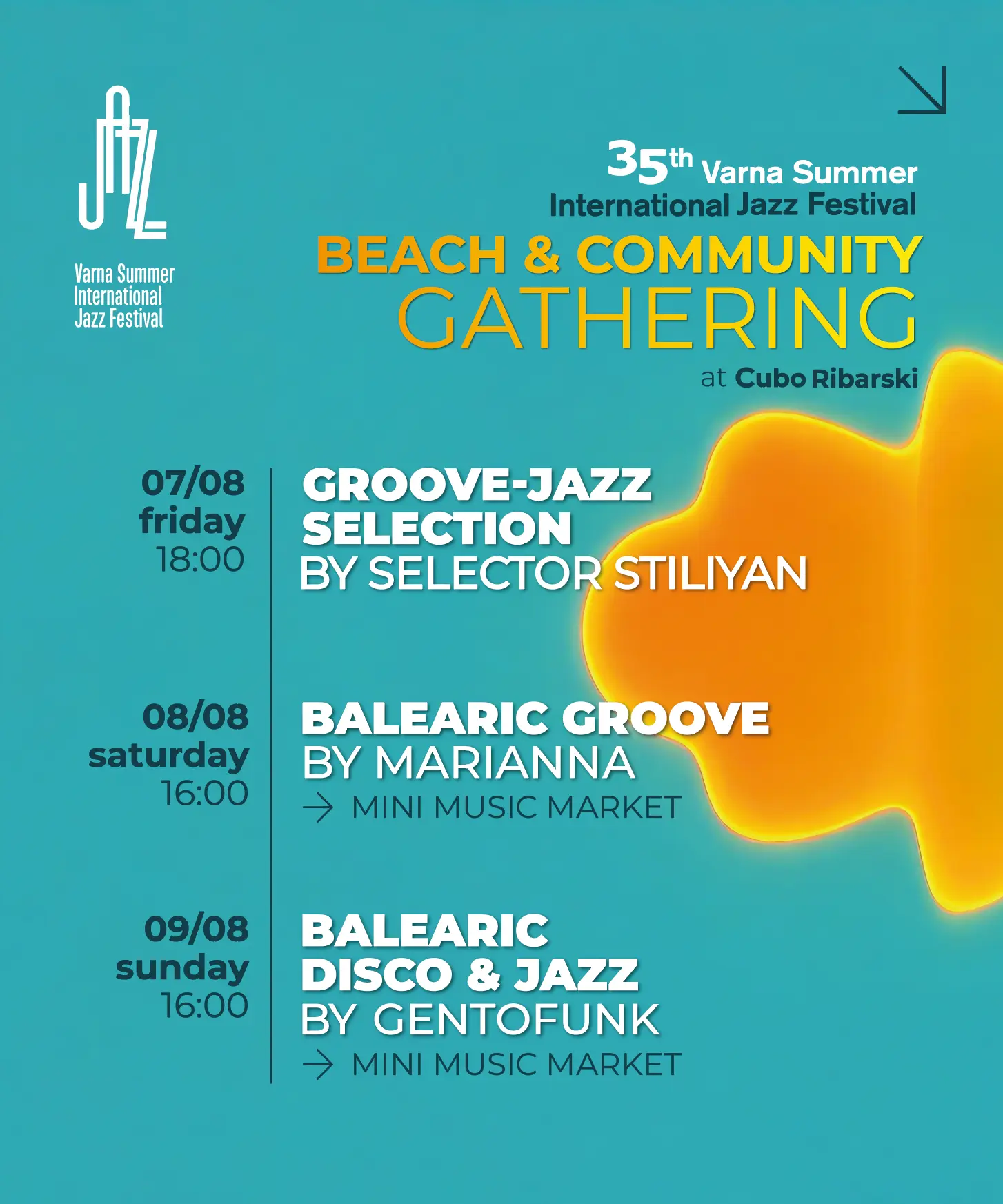
Programme layouts and venue-specific communication designed to stay consistent across dense information formats.
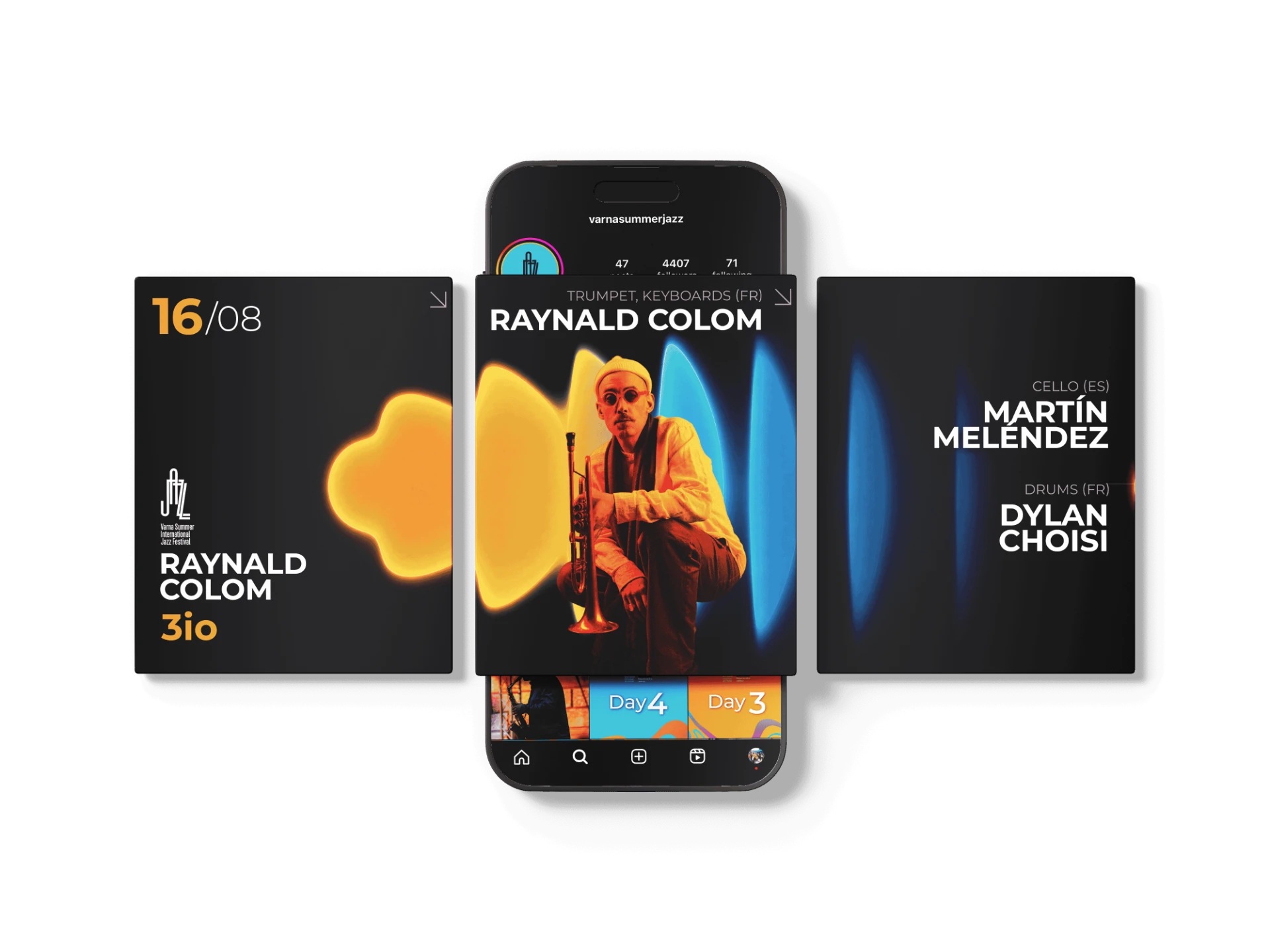
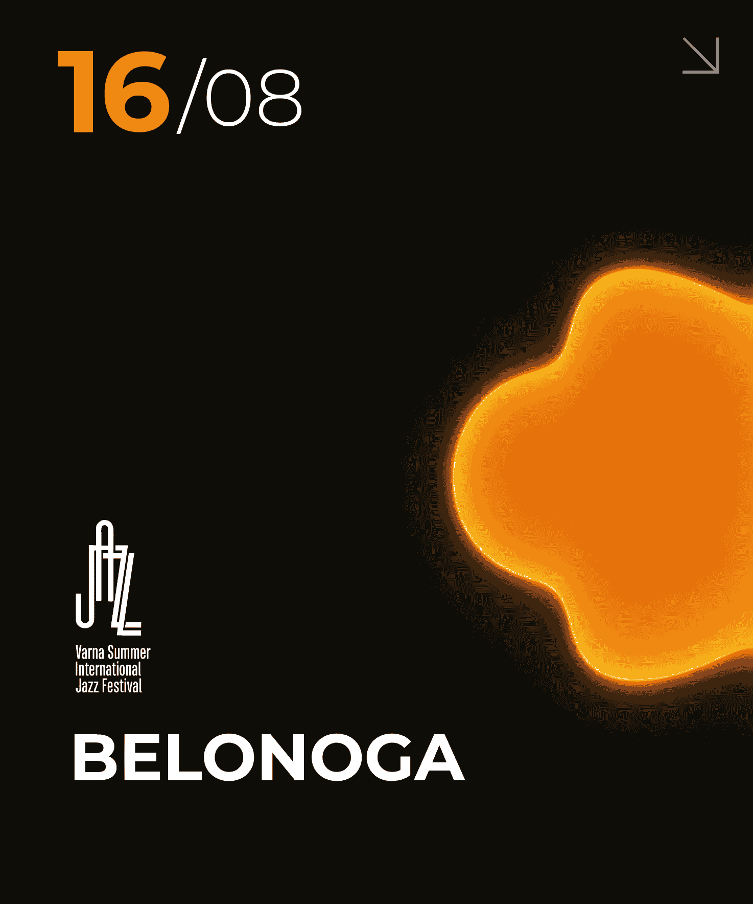
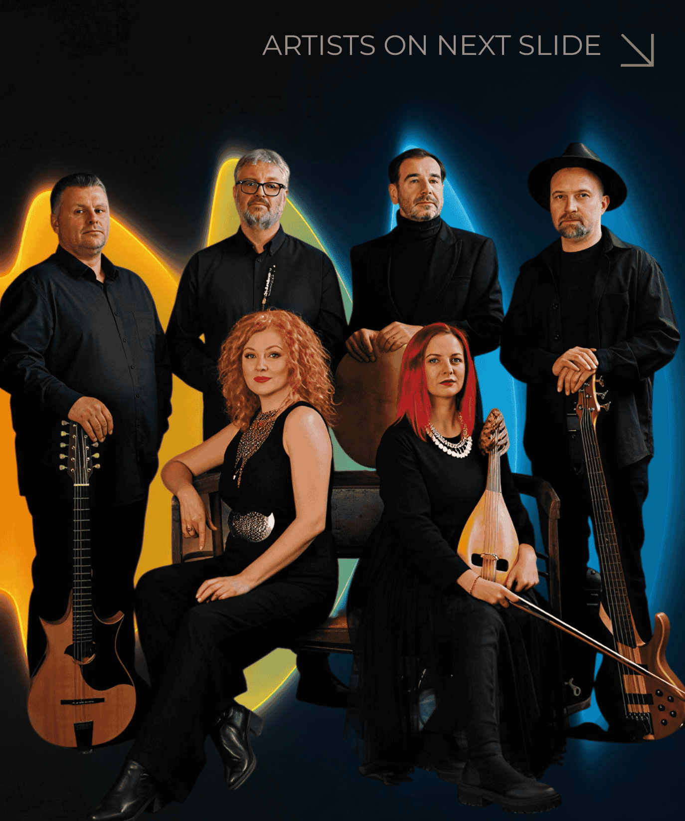
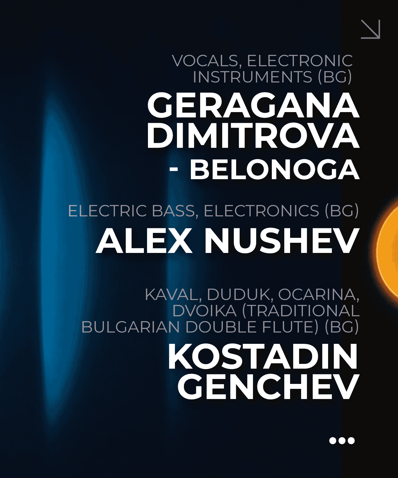
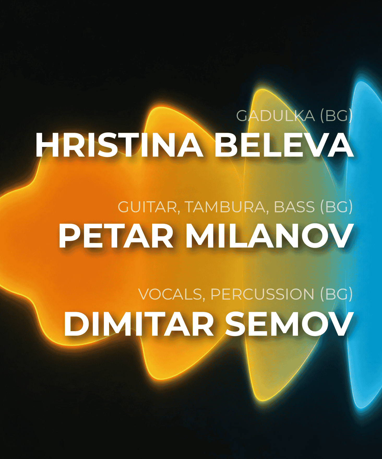
Artist communication
Performer line-ups, artist details and individual event communication adapted for social media.
1 / 4
Swipe to explore
Artist communication
05
A system built to evolve
The final identity gave the 35th edition a contemporary presence while retaining the visual associations built over 35 years.
More than a new poster, the project established a flexible visual system designed to scale across print and digital communication.
From designing individual assets to defining the system behind them.
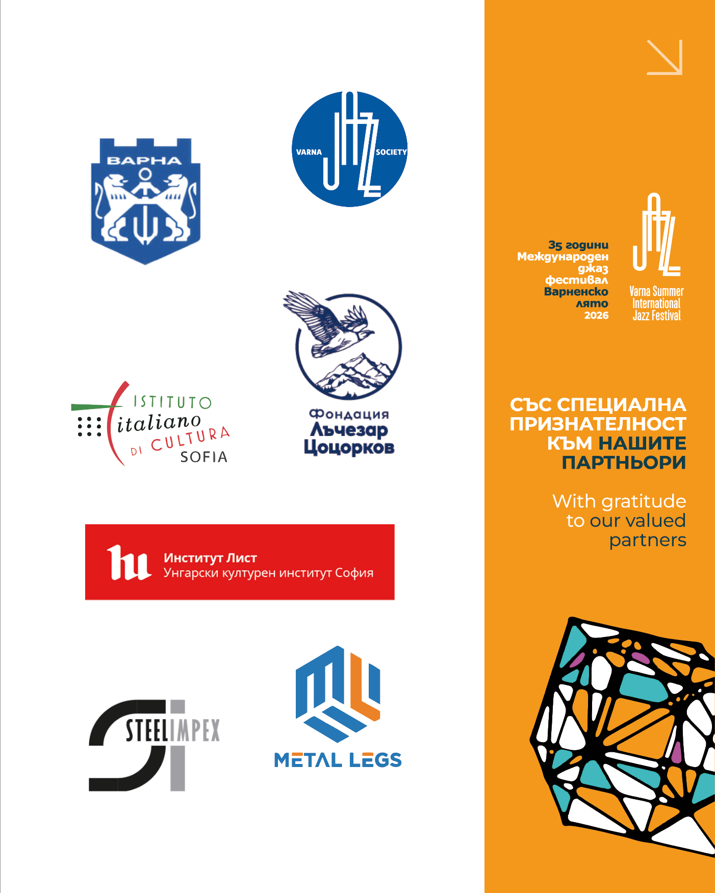
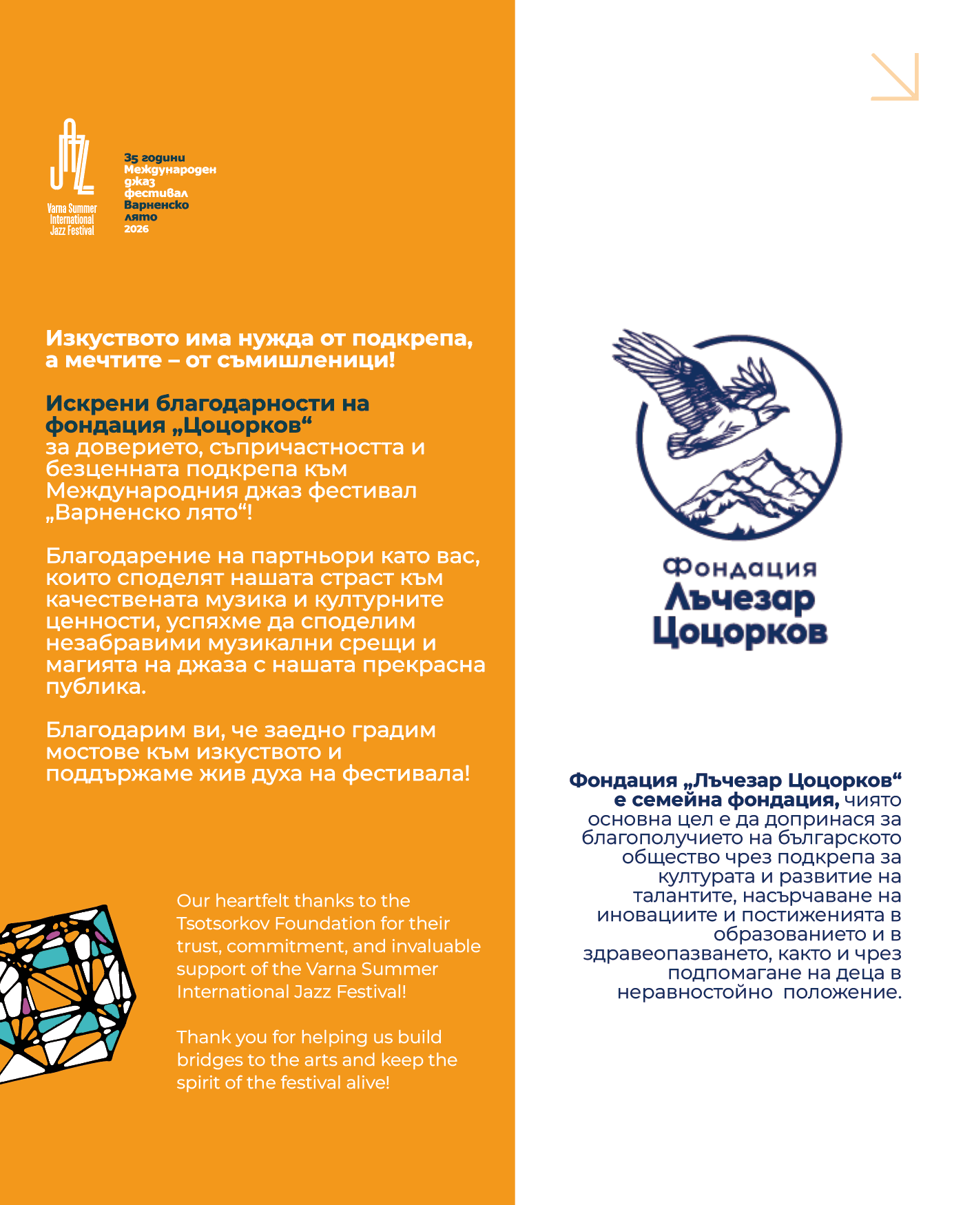
Partner and community communication
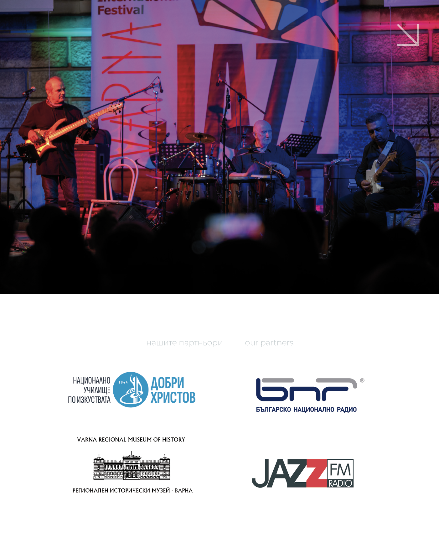
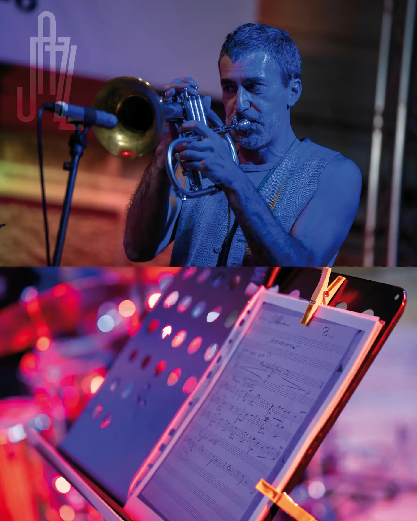
1 / 6
Swipe to explore
Partner and community communication