Status: Archived project — live site currently decommissioned.
Impact
Seven-part audit turned into a prioritised work list
Clearer product hierarchy across landing and product pages
A shorter, less ambiguous purchase path
A reusable component and assurance system
01
Understanding Riti's audiences
Two distinct audiences use the same catalogue for different reasons — one browses by benefit, the other reads for evidence. Every structural decision had to serve both.
Audience 1 — Everyday Wellness Seekers
People who want clean, trustworthy supplements for general health: energy, mood, sleep, immune support, hair/skin/nails. They need simple navigation, benefit-based categories and clear assurances like non-GMO, no preservatives, third-party tested.
Audience 2 — Evidence-Oriented Problem Solvers
People with specific issues (testosterone support, brain & memory, cholesterol) who care about ingredient quality, lab testing and GMP manufacturing. They look for detailed product pages, ingredient explanations, testing standards and external validation.
02
Where competitors fell short
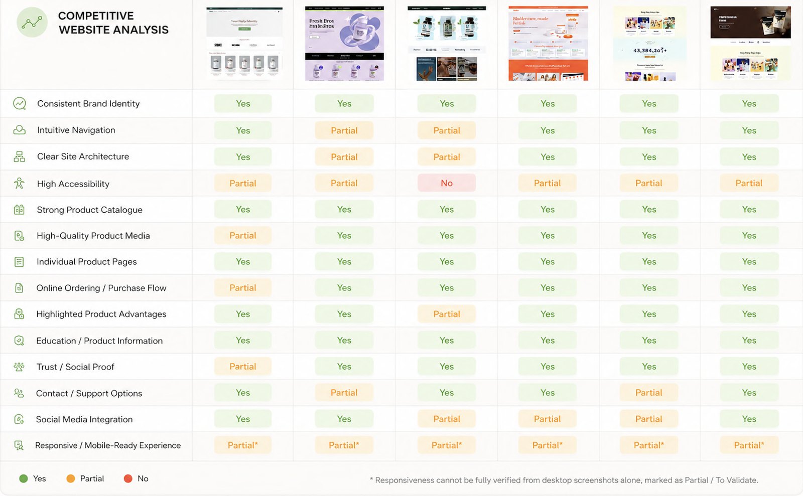
I ran a competitive analysis against similar brands to separate what's now table-stakes from where there was room to stand out.
Competitive analysis: separating table-stakes from differentiation.
03
Time for an audit
I audited the existing website in seven parts — Hero, Product list, Advantages, Technology, Additional info, Where-to-buy and Contact — annotating every usability and accessibility issue and pairing it with a fix. This turned a vague “it feels off” into a concrete, prioritised work list.
Hero section
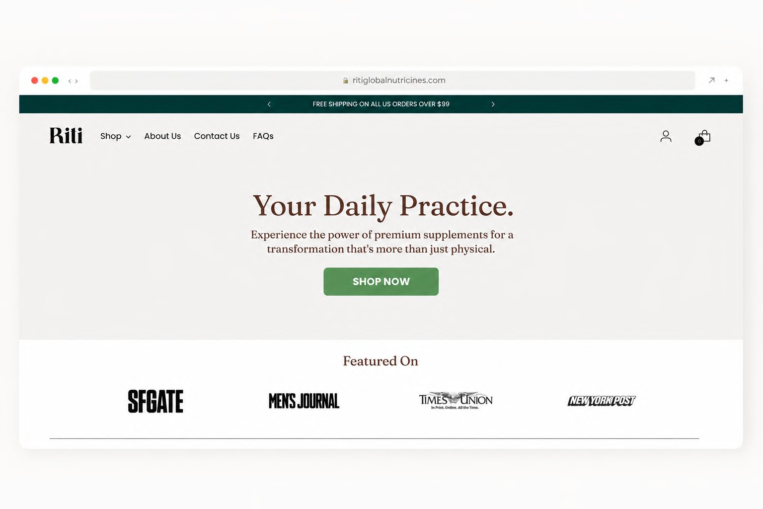
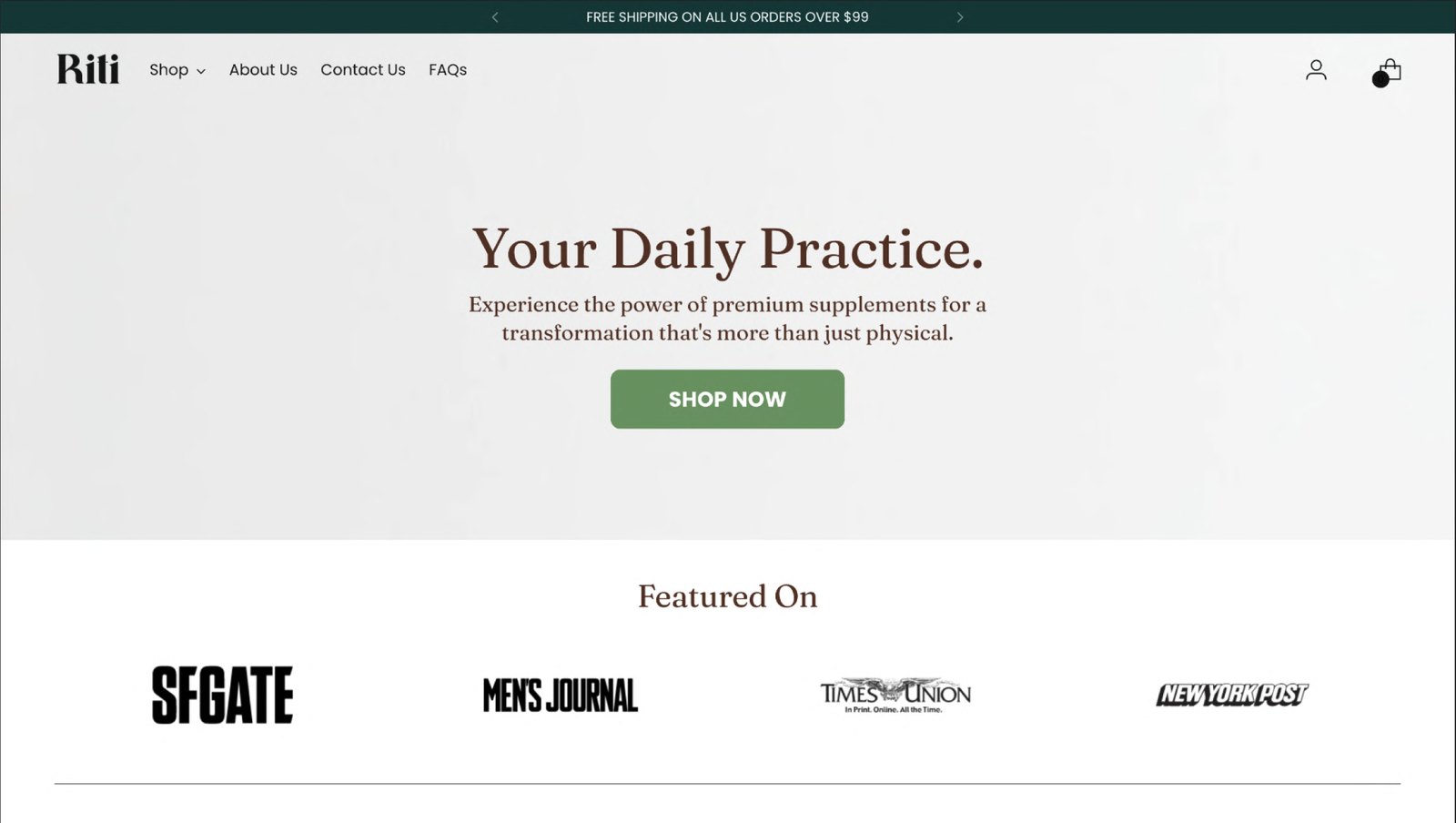
Issue — Hero not clearly product-centred — text is central, the product image feels secondary.
Fix — Make the product the focal point and show key benefits immediately, so users connect “what it is” with “why it matters” in the first screen.
Partner logos
Issue — Press logos under-emphasised — a small “Featured on” row below the hero.
Fix — Elevate third-party credibility earlier and with more visual weight.
Best Sellers
Issue — Best-seller cards are harder to scan — price, ratings and CTAs are present but not strongly structured.
Fix — Standardise the product card layout and visually separate price, rating and actions to support quick comparison.
Assurances
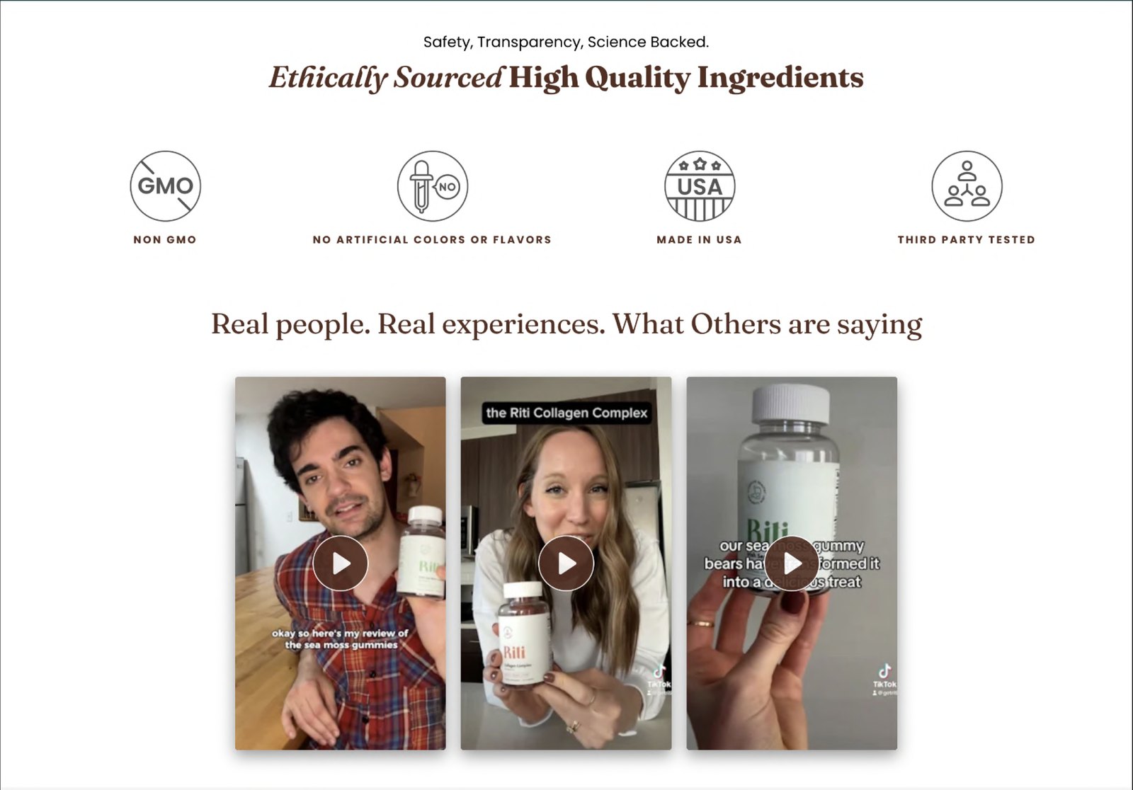
Issue — Assurances (non-GMO, no artificial additives, etc.) appear in multiple formats and sections.
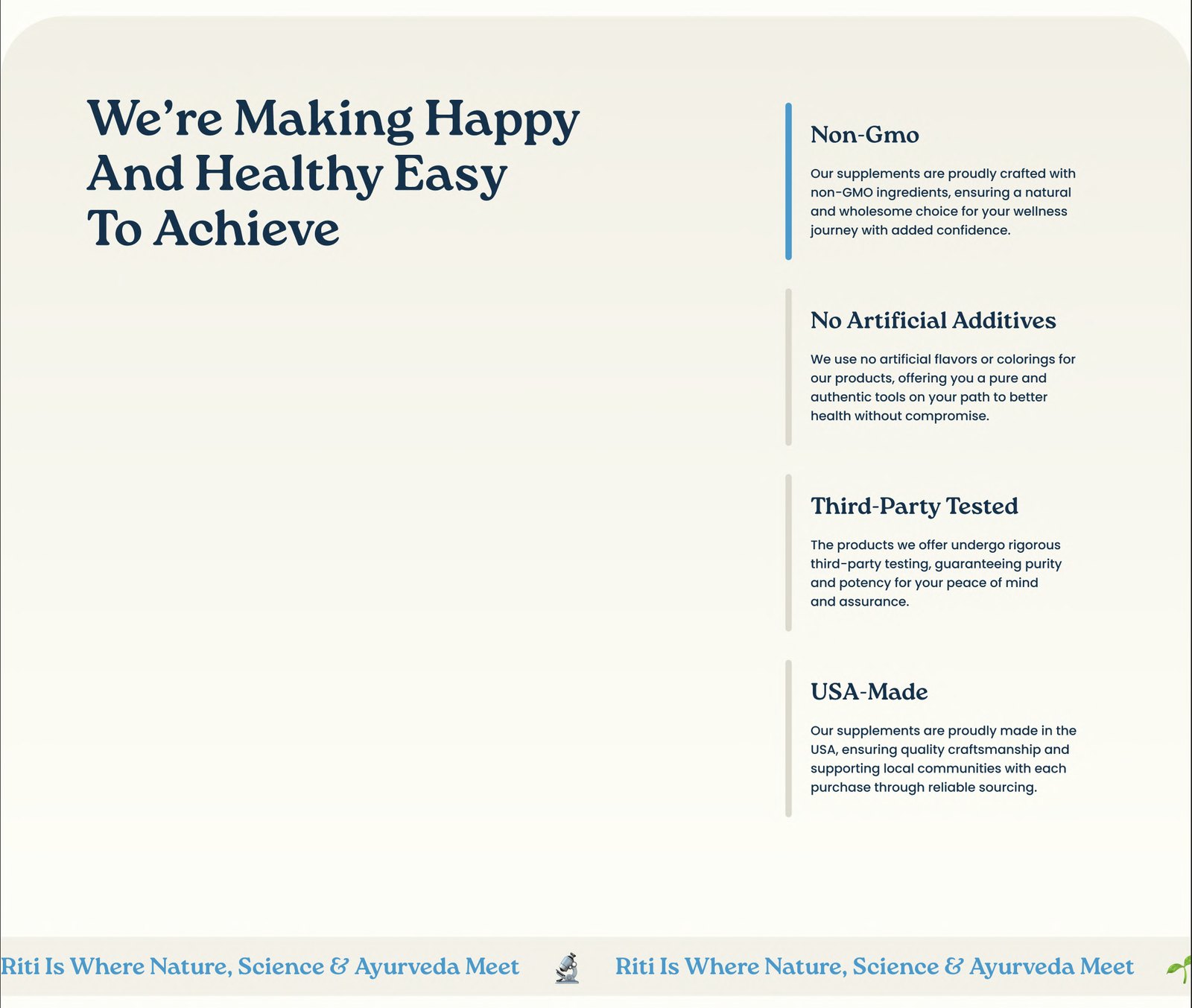
Fix — Create a single, reusable pattern for assurances and place them where key decisions happen.
Pricing
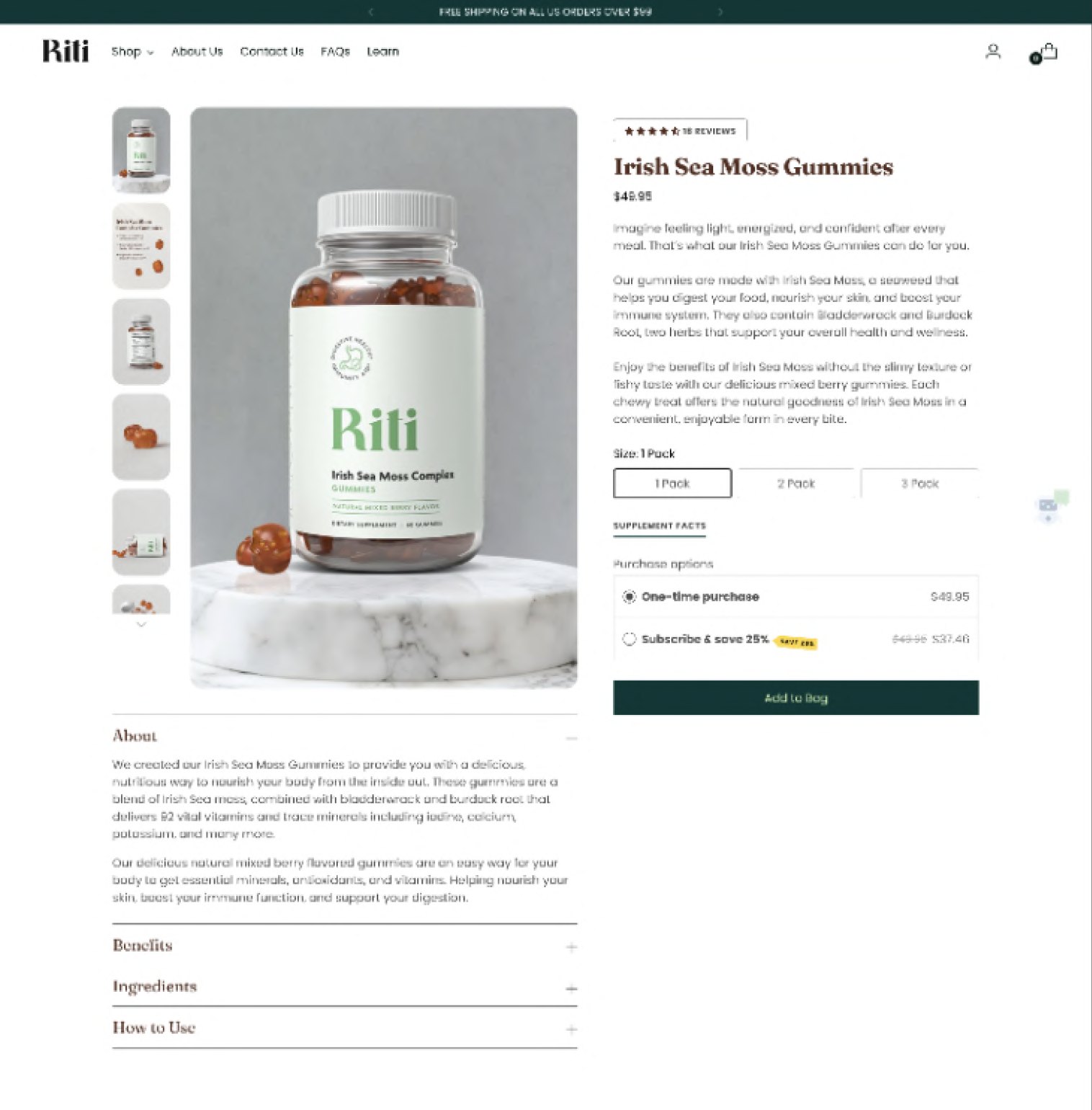
Issue — Subscription vs one-time pricing is explained mostly in text; savings are not visually obvious.
Fix — Turn purchase options into a visual comparison so users can see value at a glance.
Ingredients, benefits & cross-sell
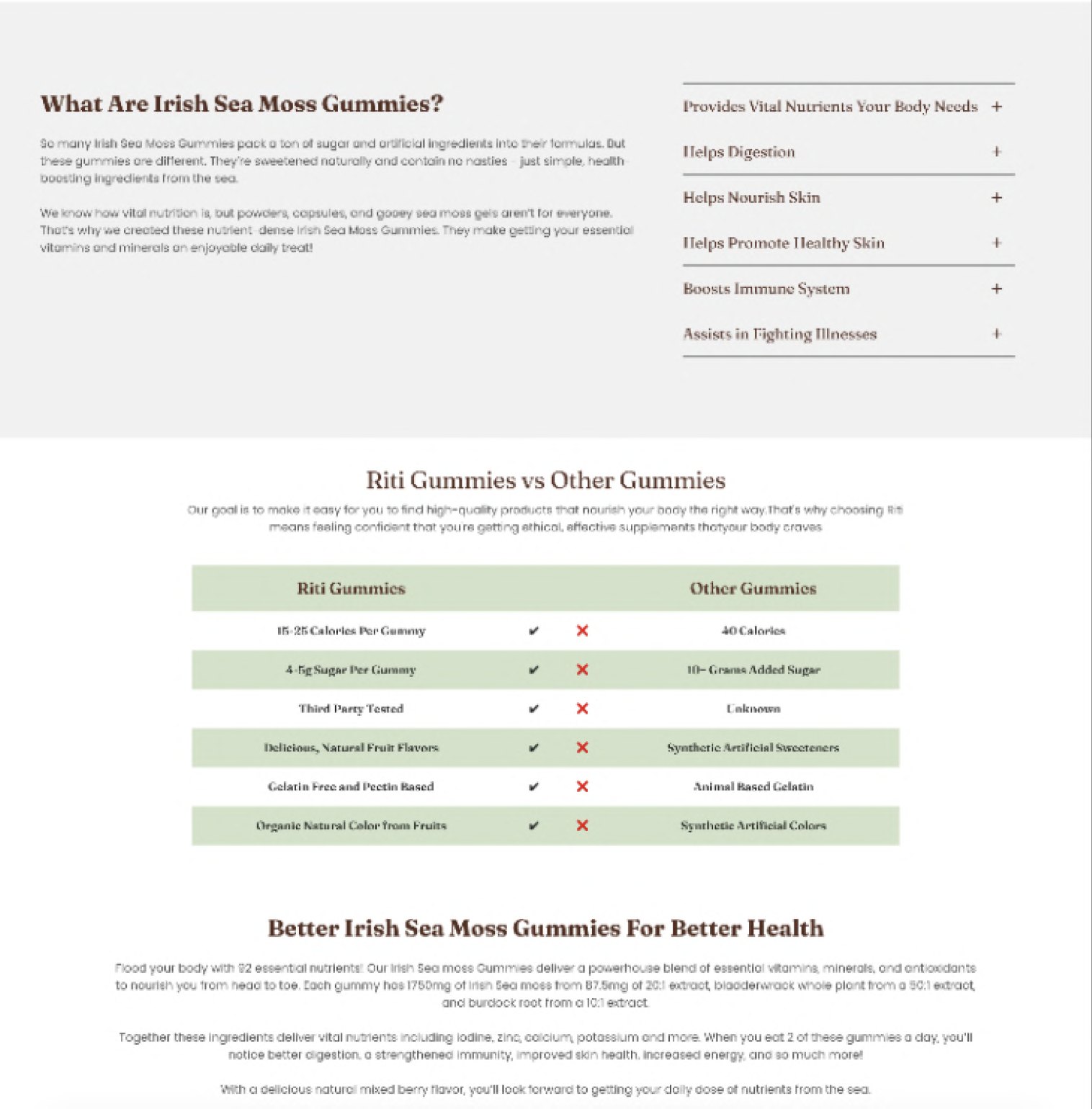
Issue — Ingredient science is buried in long paragraphs, benefits are spread across narrative text and side lists, and cross-sell appears low on the page after heavy reading.
Fix — Modularise ingredient information, present benefits as a structured list, and emphasise cross-sell while users are still actively considering options.
04
Wireframing the new flow
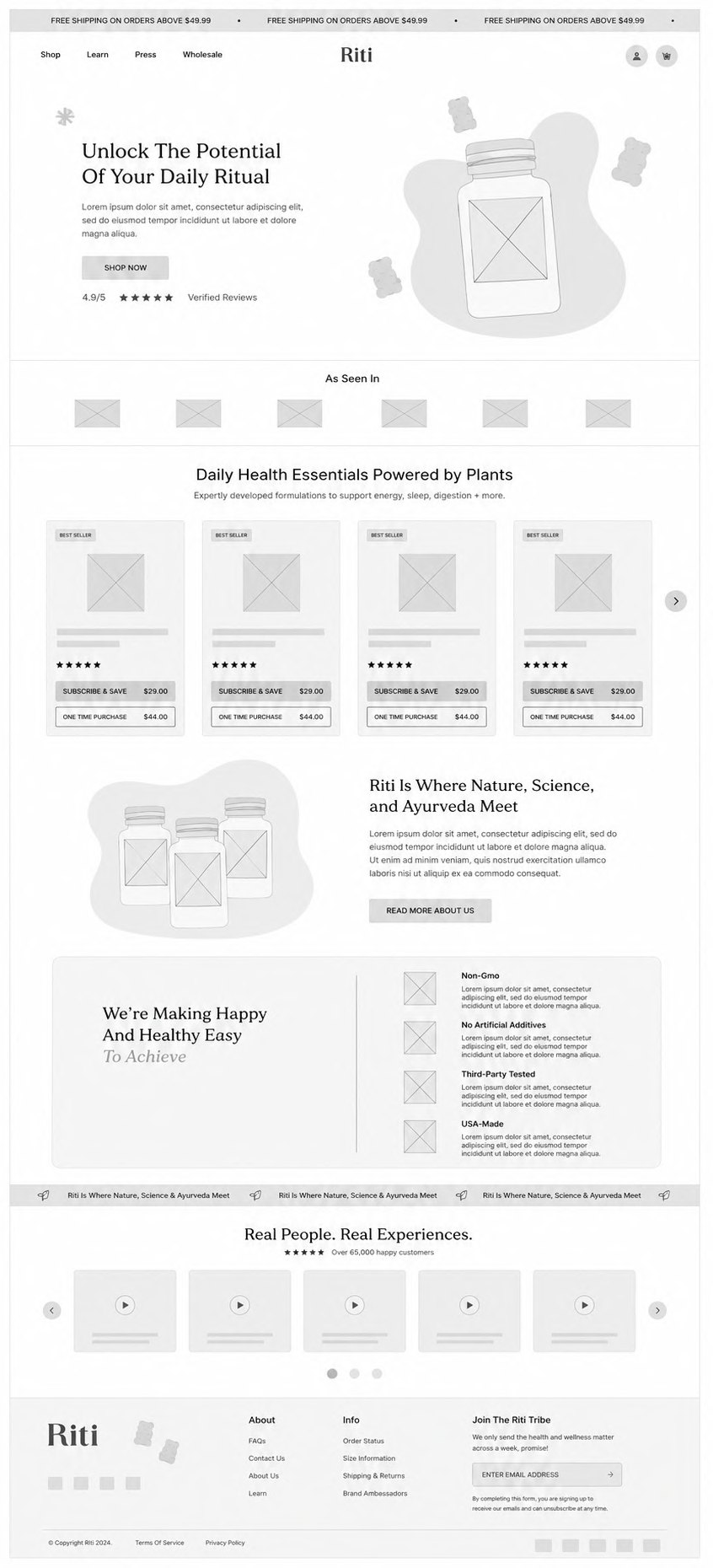
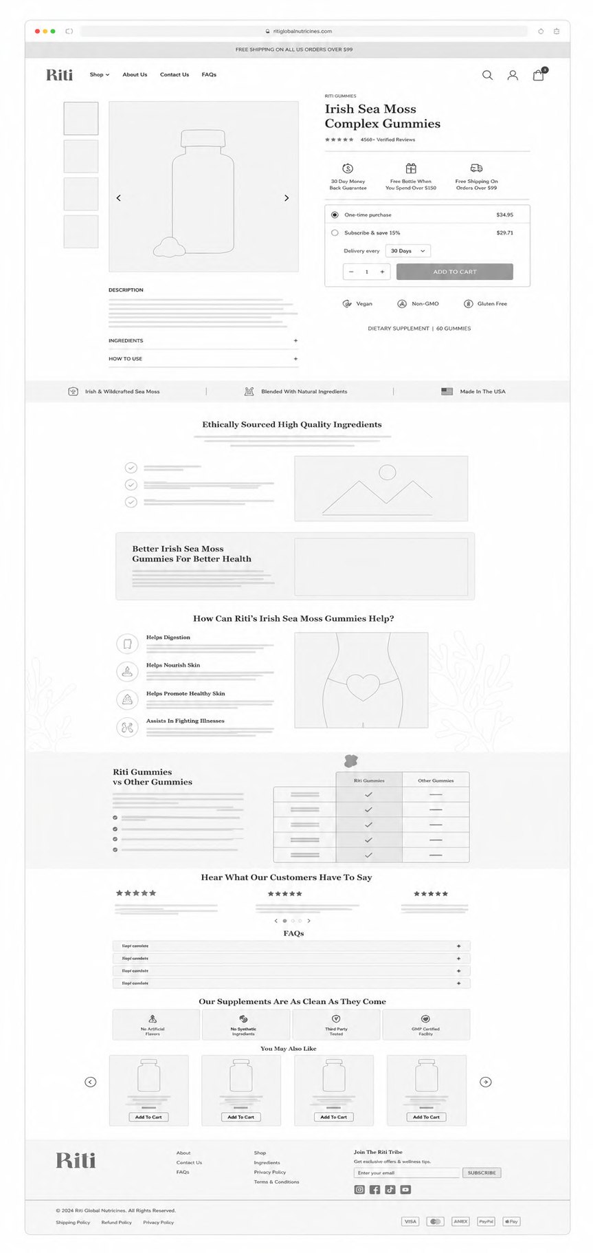
I sketched several directions for the hero and product menu, then committed to a full digital wireframe before adding any colour.
Homepage wireframe — structure before colour.Product page wireframe.
05
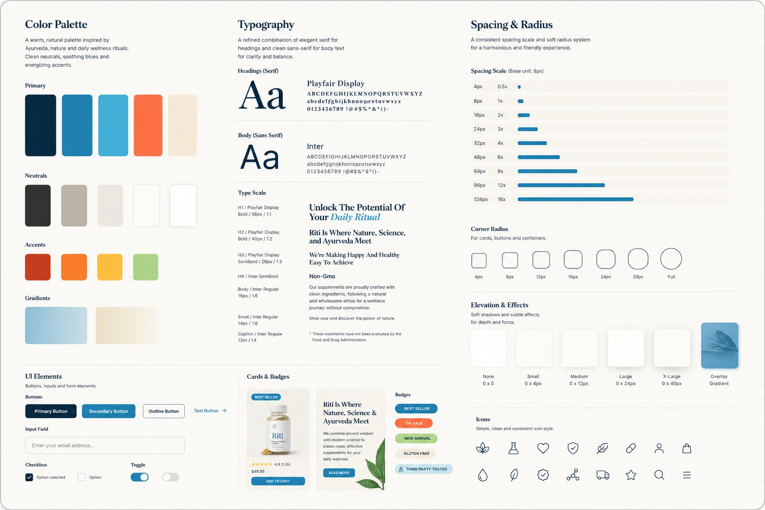
Fresh design system
A lightweight system of colour, typography and components so the landing and product pages share one visual language — and so future pages don't need new decisions.
Colour, type and component foundations.
06
The redesign — rethinking every detail
Every change traces back to a finding. The menu became easy to scan; flags became labelled language abbreviations for colour-blind users; product photos were re-shot at higher quality; selling points and the technology process moved up and got room to breathe.
Hero image
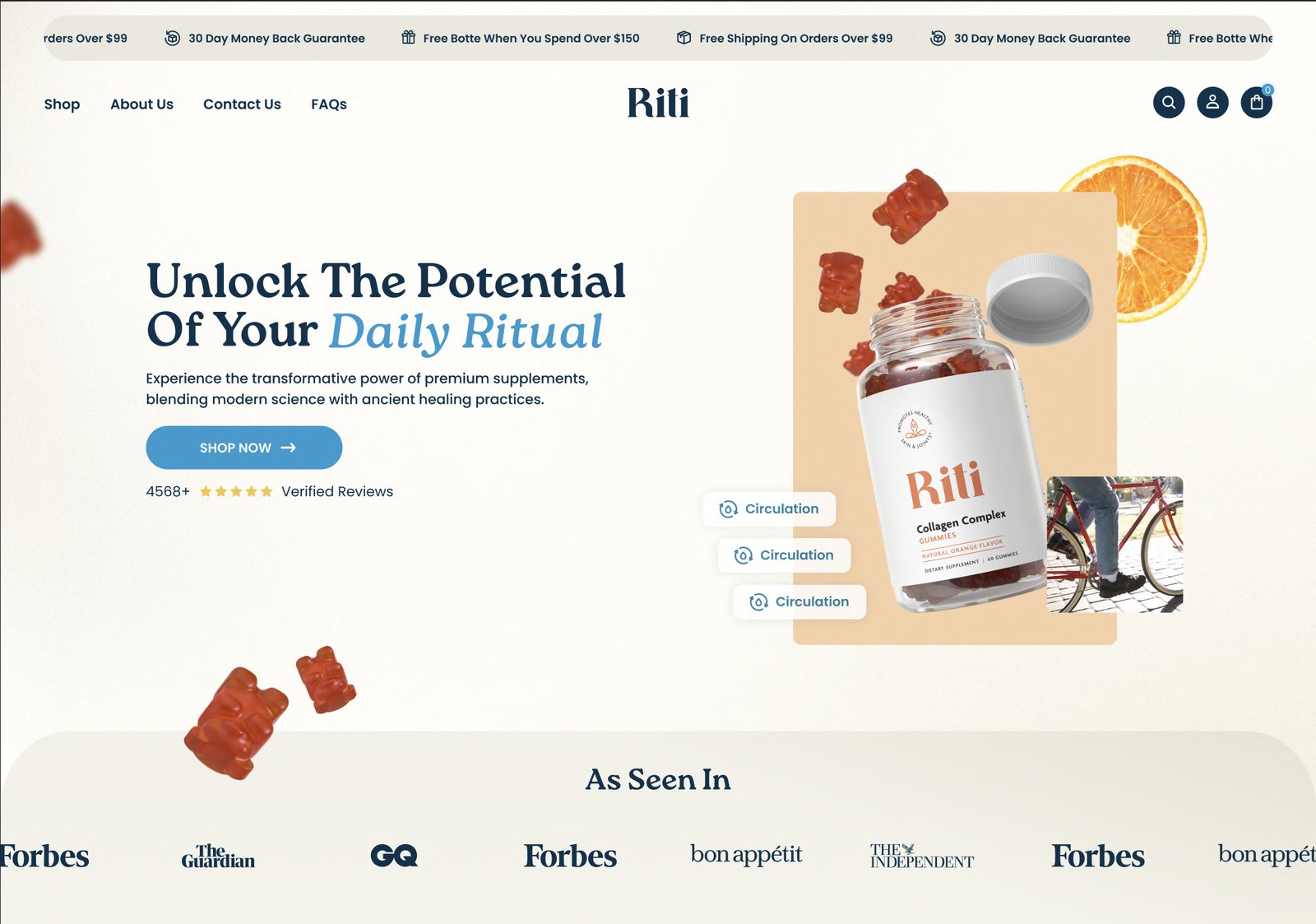
New hero enlarges the bottle, adds dynamic gummies around it, and surfaces benefit tags next to the CTA, turning the hero into a clear product + value proposition block.
Best Sellers
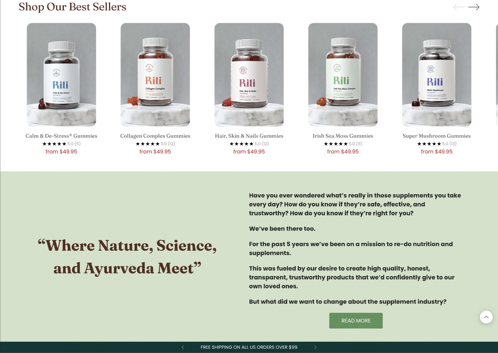
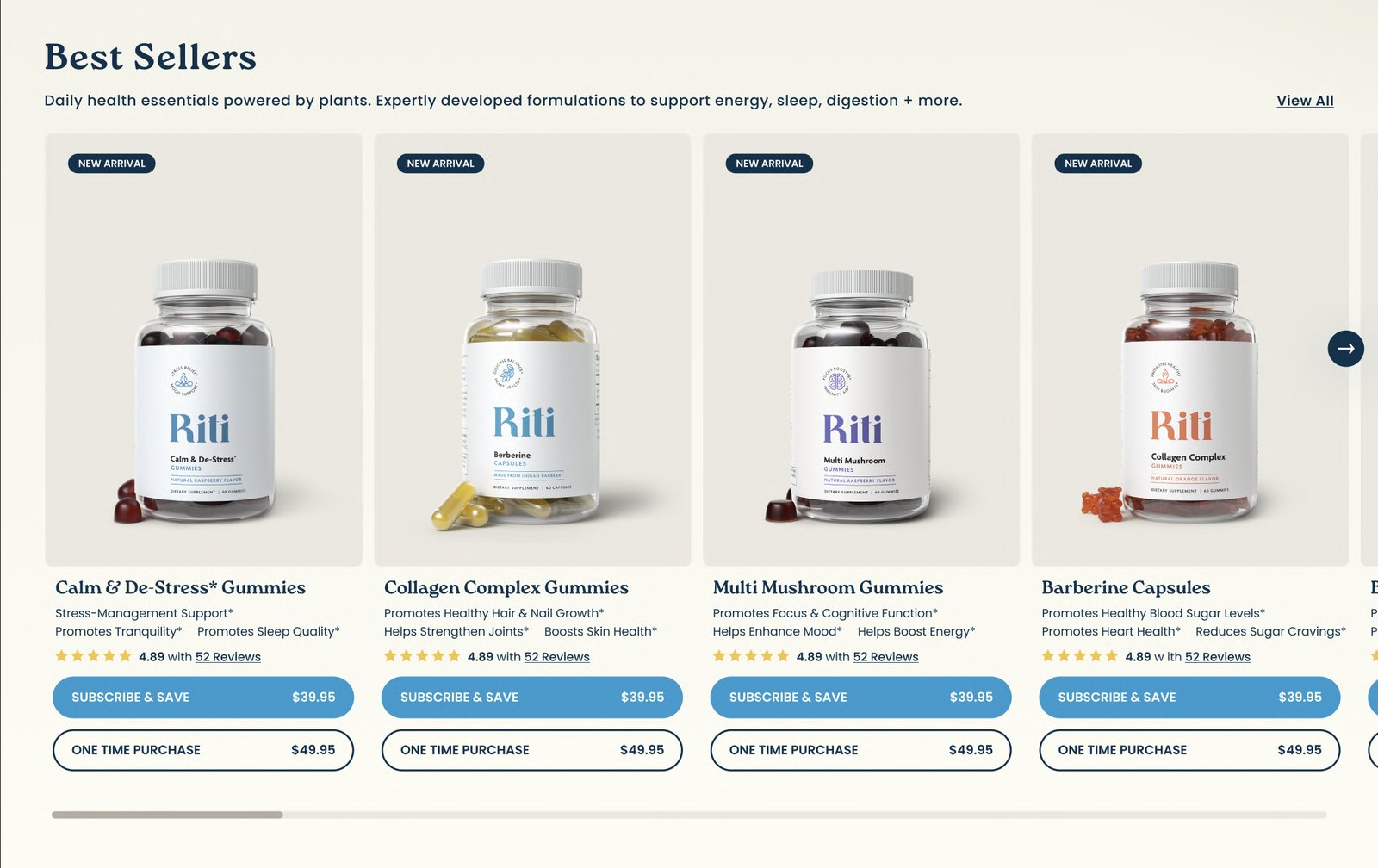
Redesigned best-seller cards use consistent rating display, clearer price hierarchy and stronger, repeated CTAs for subscribe vs one-time purchase.
New layout for the brand story
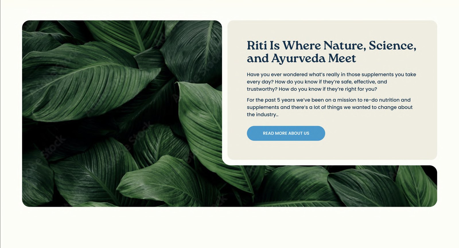
A distinct visual panel (leaf imagery) plus a concise copy block and button turns the story into a focused “learn more” module instead of a long interruption.
Consistent component system
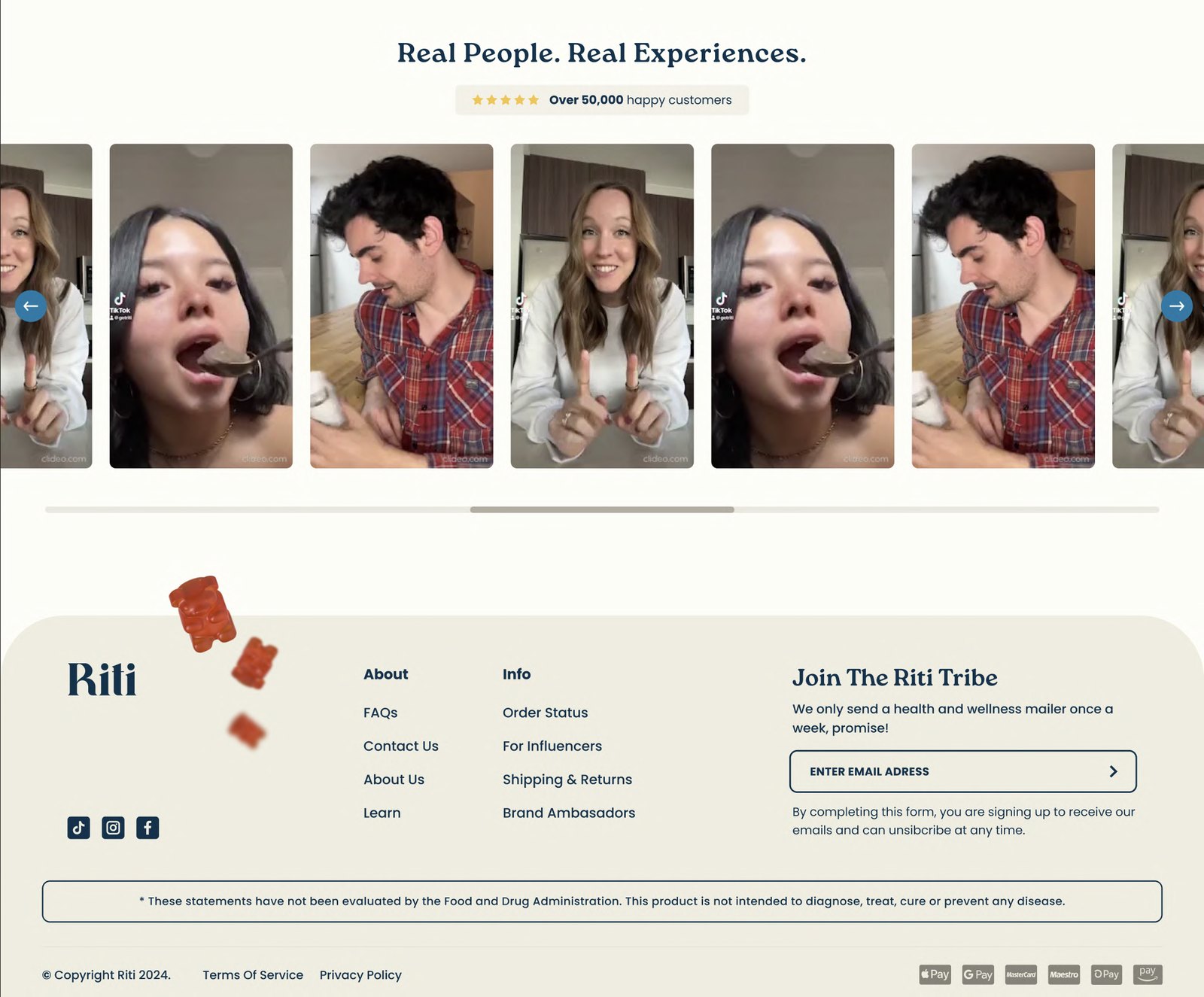
Reused patterns — hero modules, product cards, benefit bullets, assurance icons, review sections — make pages feel coherent and reduce the learning curve as users move from landing to product detail.
Stronger homepage hierarchy
The homepage now leads with a focused hero (“Your Daily Practice”), followed by press logos, bestsellers and brand story, so visitors first see what the brand stands for, then its most relevant products, then deeper narrative.