Case study · UX/UI website design
Überlube — UX/UI website design
Reframing sexual wellness as luxury care — a website concept that reframes Überlube as premium self-care.
- Role
- UX/UI Designer
- Project
- Überlube — marketing & e-commerce website concept
- Timeline
- 3 weeks
- Date
- December 2024
Concept project, aligned with uberlube.com
Impact
01
Audiences — who Überlube is designed for
Before any wireframes were made for Überlube, I first needed to understand what these products were competing against.
Audience 1 — Intimacy & wellness seekers
Visitors who see lube as part of a broader sexual-wellness routine and want something that feels premium, safe, and comfortable to browse on any device.
Audience 2 — Evidence-oriented users & professionals
Users who care about medical endorsement and performance — partners with specific concerns, clinicians, or people approaching lube as a device rather than a novelty.
02
Design language
The site uses a muted off-white background, deep green accents, and large serif headings to create a soft, editorial feel that avoids harsh or clinical tones.
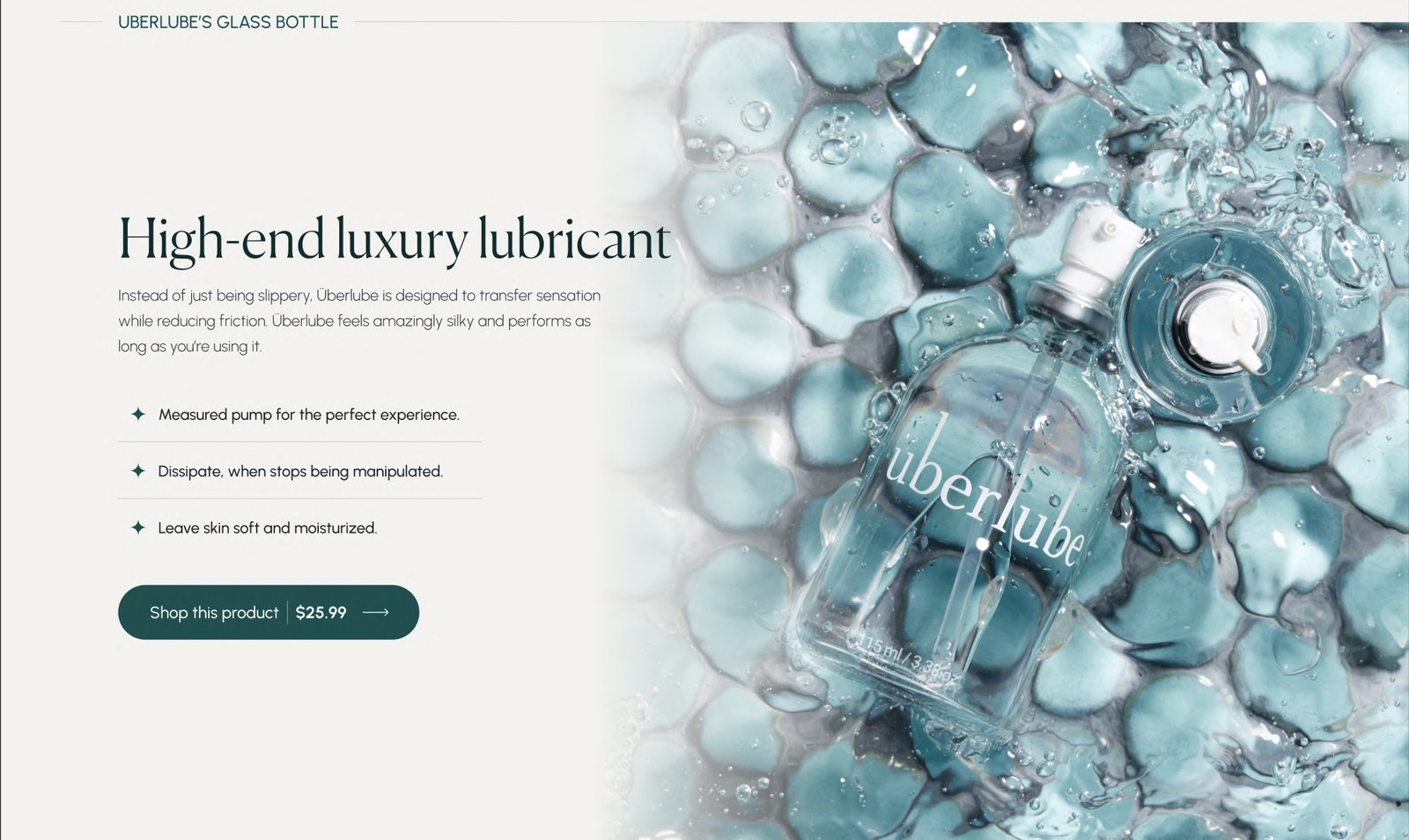
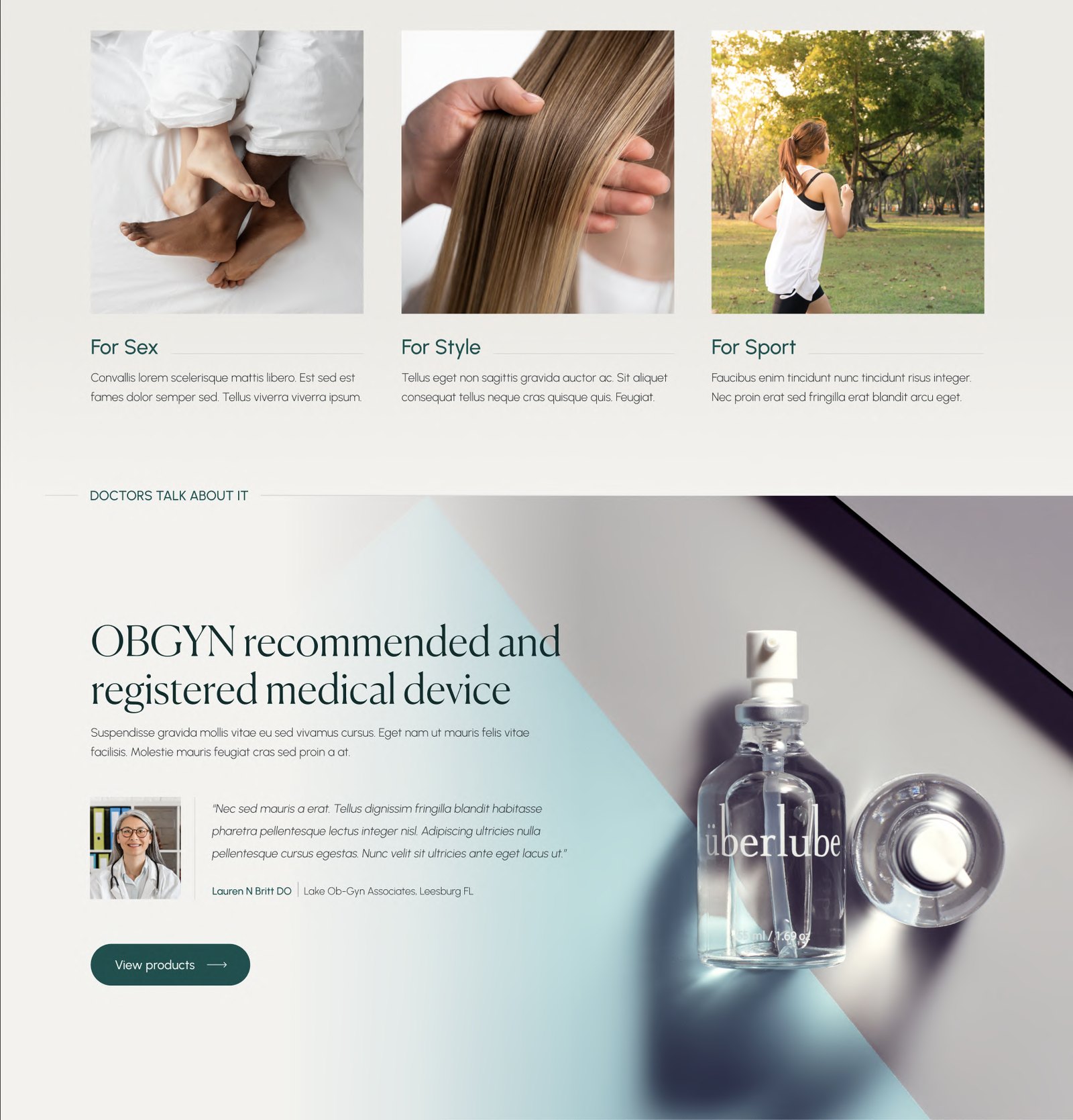
Photography is intentionally art-directed: bottles on velvet, in water or studio lighting, and lifestyle scenes (bedroom, hair, sport) represent intimacy, style and performance without explicit imagery.

03
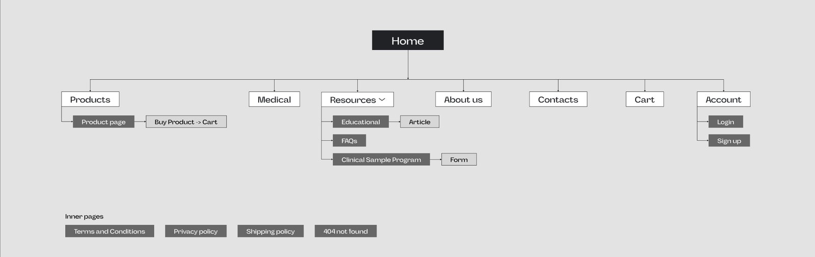
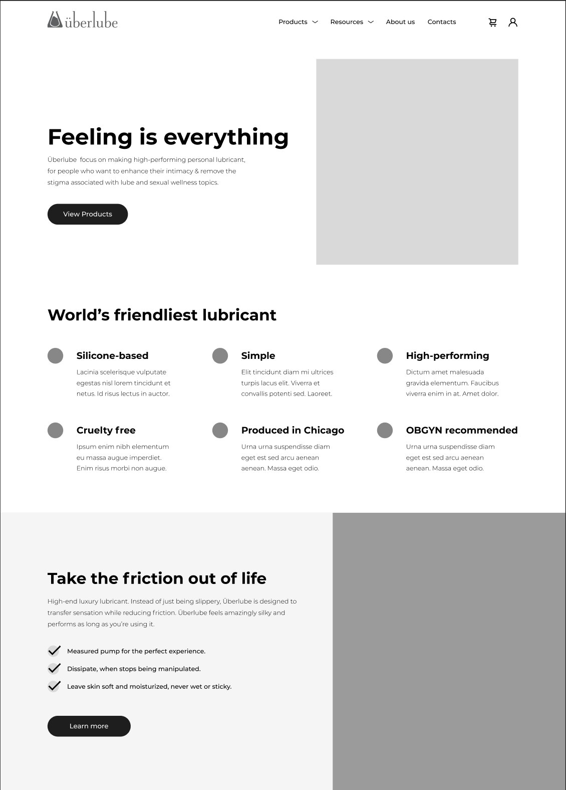
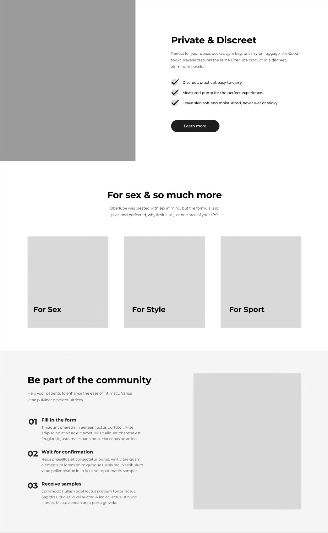
Sitemap and wireframing
The structure was mapped before any visual design: a shallow catalogue, one storytelling template per product, and supporting pages for education and brand trust.
04
The design — product storytelling
Each product page follows a tight storytelling pattern: a large hero image, one headline, one paragraph and three bullet benefits. This keeps the focus on what matters — feel, control and discretion — while a single CTA streamlines the path to purchase. Awards like “Cosmopolitan Lube Awards, Best for Travel Lube” add product-specific trust without cluttering the layout.
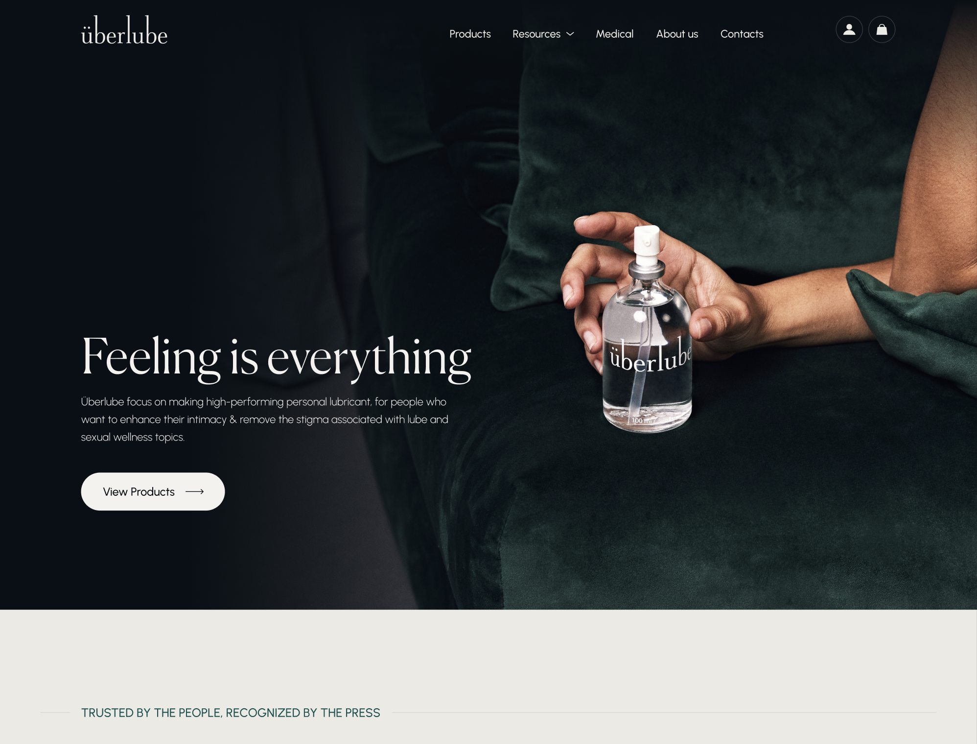
Homepage — “Feeling is everything”
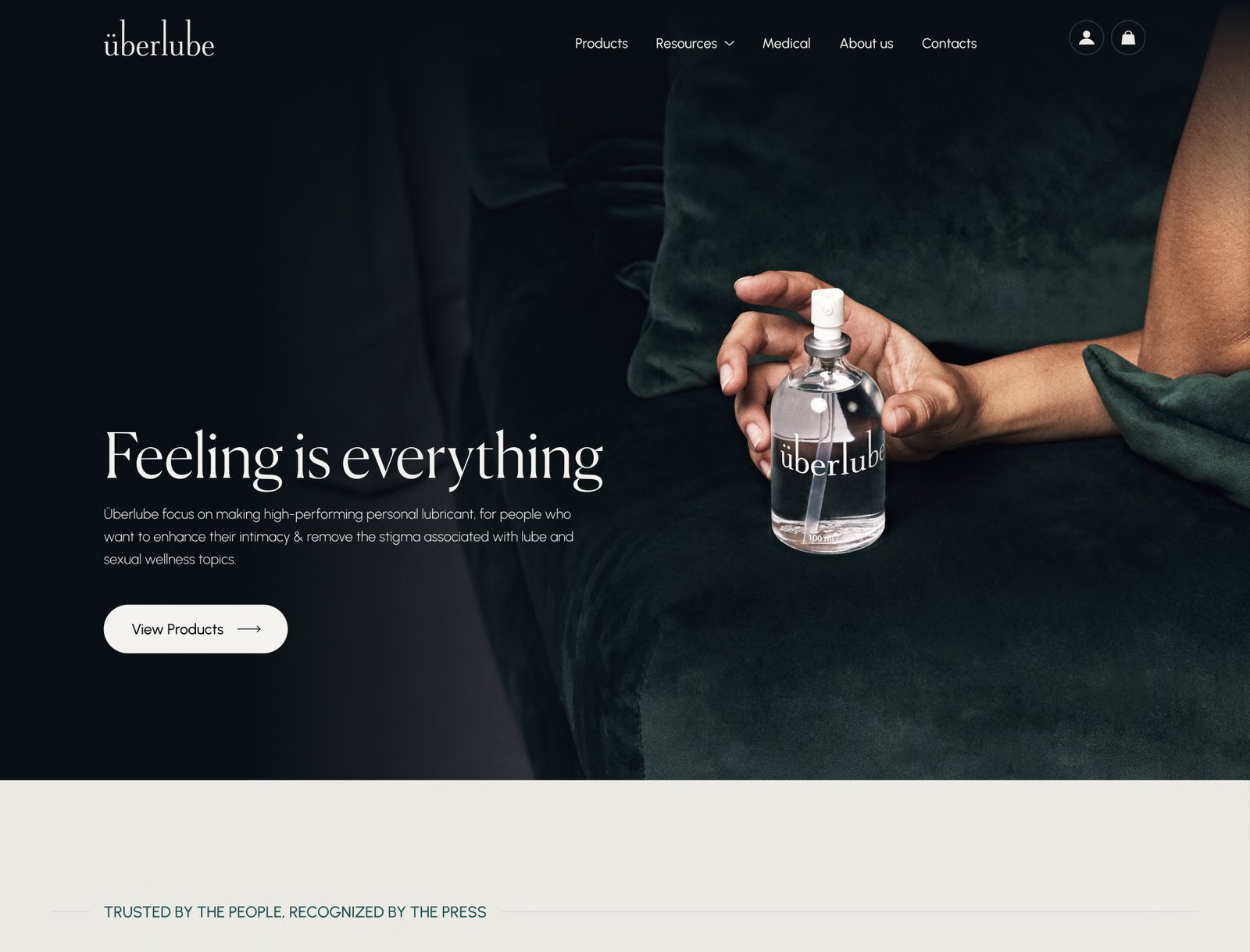
The homepage hero anchors the experience with a dark, tactile background and a close shot of the bottle held in a hand, paired with the headline “Feeling is everything.”
A single primary CTA (“View Products”) leads directly into the catalogue, reducing cognitive load and signalling a clear next step.
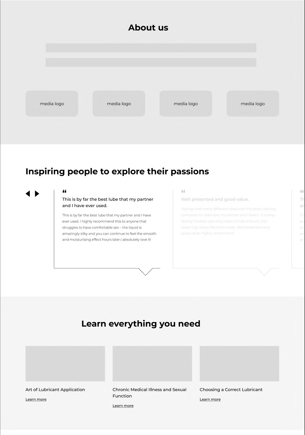
Below the hero, a press band lists logos from outlets such as Verywell Fit, BuzzFeed and GQ, framed under “Trusted by the people, recognized by the press,” giving immediate third-party validation.
Trust system — “World’s friendliest lubricant”
Moves key concerns — ethics, performance, medical recommendation, origin — into a single, easy-to-scan module instead of burying them in long FAQ text.
The phrase “friendliest” softens the category language and aligns with the brand’s inclusive positioning.
Good-to-Go Traveler
The traveler product page uses a clean studio shot of the aluminum case and cartridge, plus a “Cosmopolitan Lube Awards 2023” badge.
Copy emphasises discretion, portability and shared benefits, using the same three-bullet structure and CTA treatment for consistency.
Medical framing — doctors talk about it
Treats lube as both a lifestyle product and a medical device, which can reassure users with specific conditions or sensitivities.
The layout preserves elegance while making the endorsement explicit.
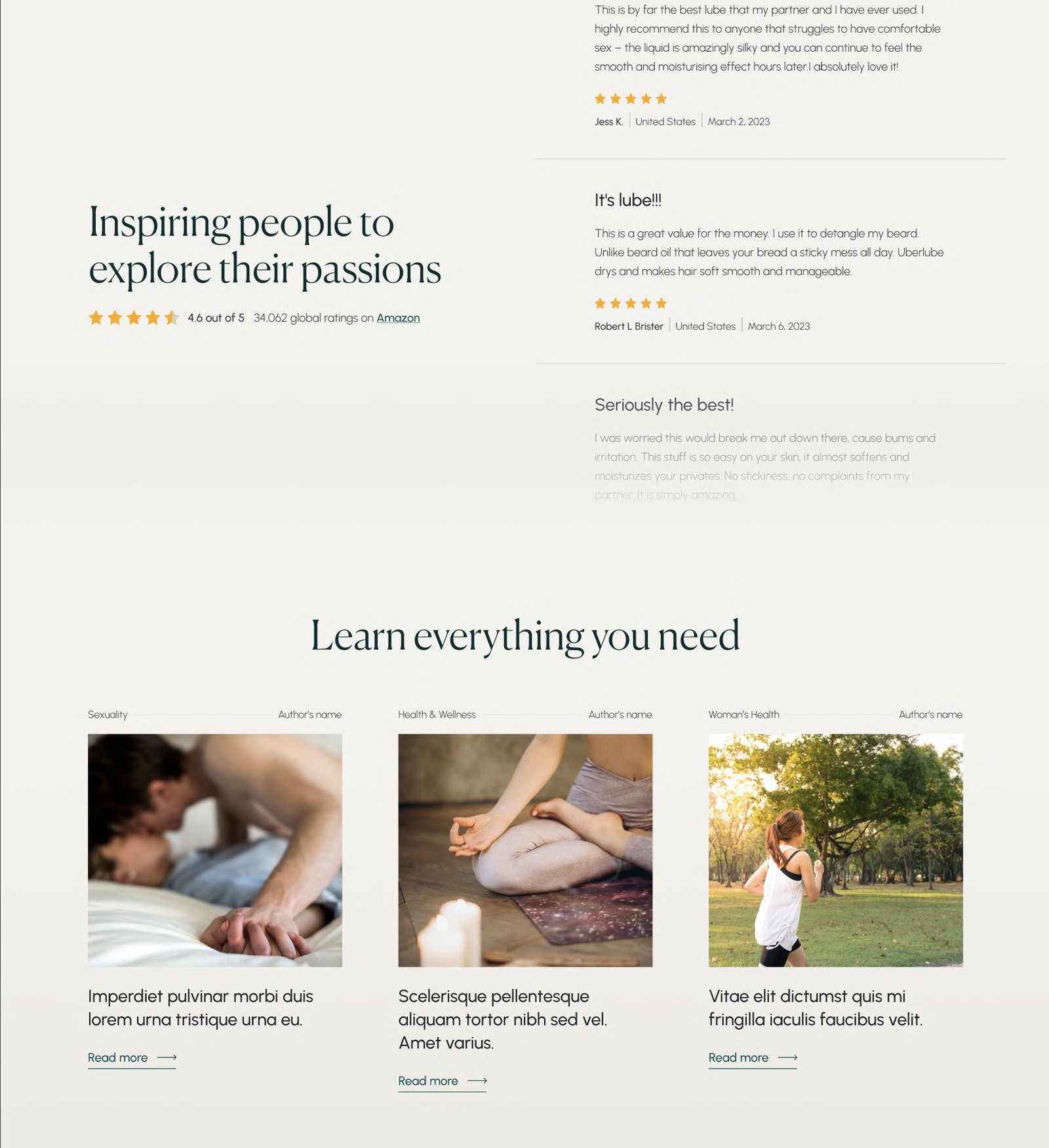
Social proof & education
Pairs emotional reassurance (stories of positive experiences) with educational resources, acknowledging that visitors may need information as well as validation.
Keeps content modular, so users can opt into deeper reading without being forced through long blocks on the main page.
Footer — secondary navigation and sign-up
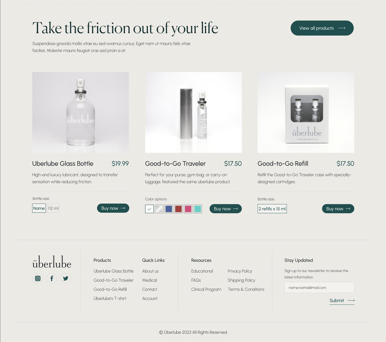
The footer contains four columns: Products, Quick Links, Resources, and a newsletter “Stay Updated” form, plus social icons and copyright.
05
What I took away
Balancing lifestyle and medical trust — combining sensual imagery with press logos, ethical claims and OBGYN endorsements showed how a single product can live comfortably in both emotional and clinical narratives.
Reusable storytelling patterns — designing a repeatable pattern (hero image + headline + paragraph + three bullets + CTA) across products made it easier to scale the site while keeping decisions simple.
Designing for comfort, not shock — treating sexual wellness like luxury self-care proved more effective than loud or explicit visuals; softness and clarity can be powerful in taboo spaces.